

EverWeb
Everything You Need To Build Your Website!
With EverWeb, anyone can create a professional website just by dragging and dropping! Use one of the built in templates, or start completely from scratch and design the perfect website for your business or personal hobby. EverWeb even creates mobile websites that look great on iPhones and iPads.
 Learn More
 Download Now
 Buy Now
Sitemap Automator
Get Your Website Listed In All Major Search Engines
XML Sitemaps are the all new way to get your websites listed in major search engines and continually receive important feedback about your search engine listings. Created by Google, XML Sitemaps have been established as a standard by major search engines included Google, Yahoo, Ask and Bing search. Use Sitemap Automator to create XML Sitemap files and get your websites listed in all major search engines!
SEIntelligence
Top Search Engine Rankings, Step by Step
We know search engines like good content, we know they like other websites linking to ours, but what about the specifics? What kind of content should we have on our website, which websites do we need to link back to us and how do we find them?
SEIntelligence has the answer to all of these questions and more.
Domainer
Manage All Your Domains and Websites
Track, manage, and find profitable domain names. Learn why competitors are outranking you and discover important SEO details including PageRank, AlexaRank, incoming links, and social tags for all of your websites. Domainer lets you keep all your domain information in one central location.
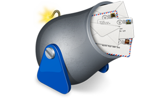
MailShoot
Easy Website Email Subscriptions & Newsletters
When you have the website and you have the visitors, how do you keep them coming back? A newsletter is the perfect marketing tool to keep your customers informed of updates to your website, new products, and special announcements. MailShoot lets you easily manage an online subscription form and send out regular updates to your subscribers.
WebCrusher
Fast Loading Websites...Instantly!
Don't make your visitors wait any longer! WebCrusher optimizes your website so it loads as fast as possible for your visitors. Using specially designed optimization techniques, WebCrusher intelligently removes unneeded website code reducing your customer's wait time.
iWeb SEO Tool
Your iWeb Website, Top Search Engine Rankings
Quickly design your website with Apple's iWeb then get top search engine rankings with iWeb SEO Tool. This tool will help you climb to the top of Google, Yahoo, Bing and more.
NEW: The complete iWeb SEO Video Walkthrough: Learn everything there is to know about search engine optimization and iWeb.
 Twitter
 Facebook
 Youtube
 Blog RSS