
Build Mobile Websites In Just 3 Steps with EverWeb
October 9th, 2015Mobile technology gives us immediate access to information at our finger tips, wherever we are, whenever we want. For website developers, though, this translates into the creating websites that cater for both mobile and desktop environments – and anything in-between. Using EverWeb you can easily do this in just three easy steps…
1. Create Your Desktop and Mobile Pages
When starting a mobile website project, first determine how many web pages you will need to build for use on mobile devices. If there will only be a few ‘mobile’ pages, you can include them in the EverWeb Project file that contains your website’s desktop pages. If you envisage having a large number of mobile pages you may find it easier to use two separate Project files, one for desktop pages and one for mobile pages, to make management of the website and its content easier. Project files containing a large number of pages can become unwieldy to use so breaking it up in to smaller pieces may be advantageous to your workflow.
If you are using two Project files, remember that you can have both of them open at the same time making content management between desktop and mobile pages relatively easy.
In this example, we are going to use EverWeb’s built in ‘Restaurant’ theme templates to create desktop and mobile pages. The restaurant website only has a few pages, so the desktop and mobile pages will be built in one Project file.
To begin with, create a new website Project file if you have not done so already. The first page to add will be the restaurant’s desktop ‘Home’ page. To do this, click on the ‘Add Page’ button in theToolbar. Select the ‘Home’ page style of the ‘Restaurant’ theme.
Once you have created the desktop ‘Home’ page, next create the mobile page counterpart. Again, use the ‘Add Page’ button, this time selecting the ‘Mobile’ page style ‘Restaurant’ theme.
With the mobile and desktop ‘Home’ template pages added, let’s take a moment to compare the two page styles. The desktop page is horizontal in layout with a page Content Width of 800, whilst the mobile page Content Width is 480. Therefore, each page style matches the environment it is intended for. The desktop layout is used for desktop computers, laptops and tablets, the mobile layout for mobile phones.
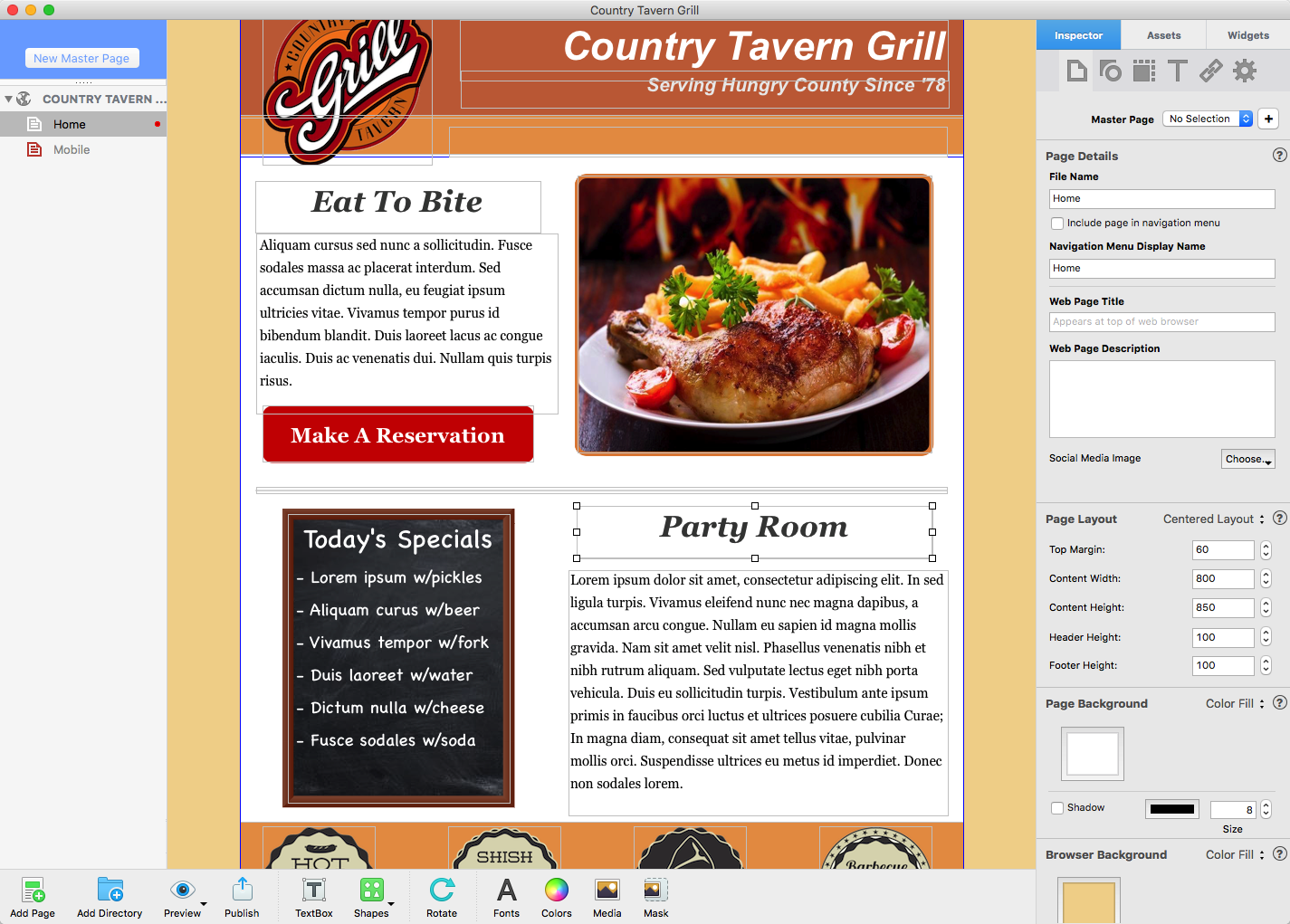
The desktop style page has a horizontal layout and allows for more content than its mobile counterpart.
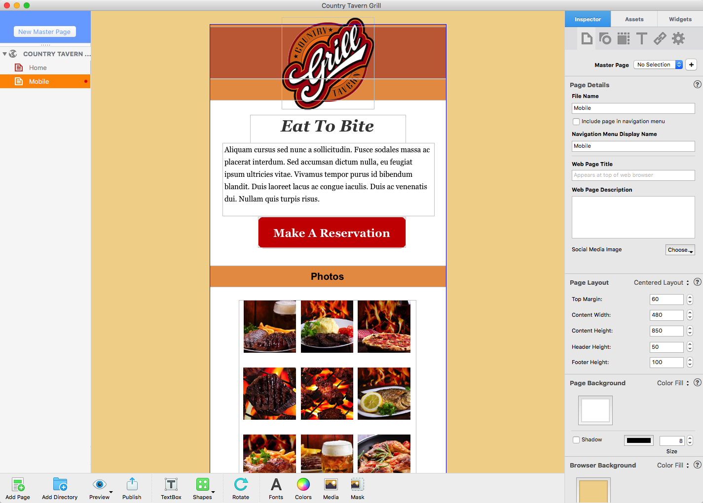
The mobile page format is a one column vertical layout with plenty of space on each side for scrolling up and down the page .
The desktop page has much more content than its mobile counterpart. The mobile page has been stripped down to just the essentials. Non essential text and graphics seen on the desktop site have been removed. This helps the mobile page load faster and avoids cluttering up the smaller screen display. The mobile page also space on each side of the page specifically to accommodate easier scrolling up and down the page.
Furthermore, the ‘message’ of the desktop page, ’Eat to Bite’, is located where the visitor’s eye is usually drawn to – the upper left hand corner of the screen. The ‘message’ of the mobile home page is also clear – ‘Eat to Bite’, but this time is front and centre, taking advantage of the mobile form factor. The photos highly visible as well to try to tempt you to make a reservation.
The ‘Make A Reservation’ button itself is prominent on the mobile page, with the button text large and the font easy to read. The three graphic elements below the Contact Form have potential to be used as large buttons linking to other pages as they are easy to use in a touch centric environment. The Contact Form itself only a few fields to fill on the mobile page and so will take less time for any visitor to complete. The use of the Contact Form saves visitors from clicking to another page. This is advantageous when your visitor is in a poor reception area.
The Image Gallery is used to show some of the restaurant dishes in preference to text descriptions that could be used on the desktop page. When using photos be careful about their file sizes as large photo files will slow page download speeds
One more thing to note about the mobile page is that it has no navigation menu, whereas the desktop page does. Navigation menus on mobile devices can frustrate users as they can be difficult to use. For mobile devices, go for large hyperlinked buttons, graphics or images that are easier to ‘click’ on with your finger.
The above mobile page strategies outlined above will help keep your visitor on one page. The design helps encourage the visitor to scroll up and down the page, rather than having to load other pages, so keeping your visitor focused!
2 Linking Desktop and Mobile Pages…
In our restaurant example, we want to link the desktop ‘Home’ page with the mobile ‘Home’ page so that when published you automatically see the desktop page on a desktop device and the mobile page on a mobile device. To set up the linking first select the mobile page. In the Page Settings Tab of the Inspector Window, scroll down to the ‘Mobile Settings’ section. On the left of the section, click on the arrow to expand the section contents. Make sure ‘This page is for mobile devices’ is checked. If it is not, check the box.
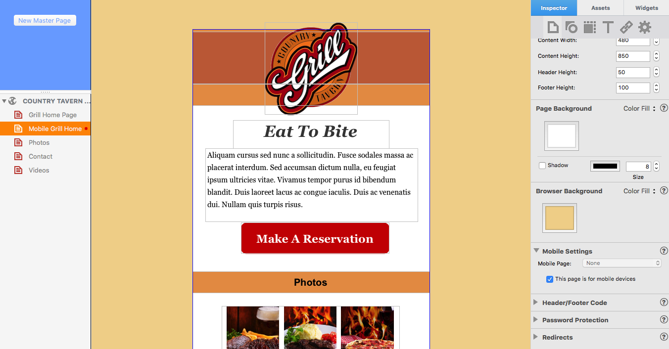
The mobile settings the Inspector Window checked to show that the page is for use on mobile devices.
Next select the desktop ‘Home’ page. Again go to the ‘Mobile Settings’ in the Page Settings Tab. This time set ‘Mobile Page’ to ‘One of My Pages’. In the box beneath it, set the ‘Page’ to the name you have given to your mobile ‘Home’ page. See the screenshot below.
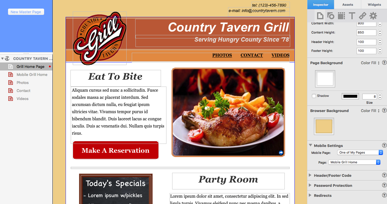
The mobile settings for the desktop page. Here the settings shows that the page is linked to another page in this example, the mobile home page.
The ‘One of My Pages’ drop down box can alternatively be used to select an external page using a URL link, or to ‘None’. If you are using two Project files, one for desktop and one for mobile, for your website, use the URL link to connect the mobile page to the desktop page.
3. Publish!
Repeat the linking steps for any other pages that require it. When complete, publish your website. Use different devices to see how your pages look on mobile and desktop devices and how EverWeb switches automatically page type as needed!
Bonus Tips…
1. When you build mobile pages remember to include Search Engine Optimisation which is increasingly important in the mobile arena.
2. Remember to make a ‘404 Error Page’ for your mobile website. It’s not only desktop pages that need it!
 Twitter
 Facebook
 Youtube
 Blog RSS