
Getting the Most From Your Mouse and EverWeb’s Shape Option Feature!
June 27th, 2025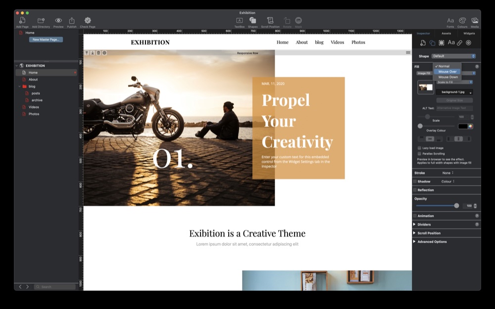
Your computer’s mouse is a powerful tool that has been with us since its invention by Doug Engelbart back in 1964. For desktop users a mouse, or equivalents such as a trackpad, remain essential, even 60 plus years later on… You can take advantage of the mouse in your EverWeb project! Here’s how…
About The Three Mouse States…
First of all, we need to look at the three ‘mouse states’ as this is key to adding features to your site in EverWeb. When you use a mouse or trackpad, it will be in one of three states at any time. The first state is ‘Normal’, where you use the mouse to cursor, or move, from A to B on screen. The second state is when you hover, or ‘Mouse Over’. something on screen, e.g. hyperlinked text, or a button, which leads to a change in the target object’s behavior. The third state is ‘Mouse Down’ where an action results when you click on the target object that you have hovered over, for example, clicking on a menu item will take you to another page in your site.
EverWeb allows you to control what happens for each of these states using the Shape Options tab in the Inspector Window.
Example: Creating a Button…
In this example, we are going to create a button which we are then going to use to demonstrate how the mouse states work in EverWeb. Begin by adding a Regular Rectangle shape to the page, using the Toolbar. We can then size the button as desired using the grab handles.
Next we can add a label to the button simply by double clicking inside the shape, then typing the text label we want, in the same way that we would do if we were adding text to a TextBox. After styling the text, or applying a Paragraph Style to the text, the last step is to center the text within the button. To do this we just click on the Horizontal Alignment Center button and Vertical Alignment Middle button in the Alignment section. The button text is still not perfectly centered though as we need to set the After Paragraph value in the Spacing section to zero. Our button is now complete. With the button still selected, we click on the Shape Options tab in the Inspector Window for the next steps!
Using Shape Options…
Now that the button is complete we can apply Shape Options to it. Let’s start with the Fill section. Notice that to the right of the word ‘Fill’ is a dropdown menu with ‘Normal’ as its current setting. This corresponds to the ‘Normal’ mouse state as it relates to the currently selected object. If we click on the dropdown menu, we can see the other two states: ‘Mouse Over’ and ‘Mouse Down’. When working with objects and their Shape Options, always remember to check the selected object’s ‘State’ first, before adjusting any options.
When we add a shape to the page, by default its Color Fill will be blue, unless the default has been changed using the Format-> Default Styles… menu option.
We can change the Color Fill to something else if we want, just by clicking on the menu then selecting the desired Fill type e.g. Advanced Gradient Fill, or even Image Fill. As we are working with a button, it is likely that only a few options will apply here. In our example, we will stay with Color Fill as it is simple and clean in appearance to air visitors.
The next step is to think about what we want to happen when our visitor you mouse over the button. In our example, we want the background color to become yellow when moused over. To start we click on ‘Normal’ menu option and change it to ‘Mouse Over’. Next, we select the type of Fill which we is currently set to ‘None’. In our example, we will choose ‘Color Fill’ again. Finally, we will click on the color swatch below the Fill Type menu, then choose the yellow color swatch.
The button in the Editor Window will not change when we mouse over it, but that is alright for the moment. The final step is to repeat the above process, this time changing the mouse state menu option from ‘Mouse Over’ to Mouse Down. In our example, we would again set the Fill Type to be ‘Color Fill’, then select a green color as the choice for when our visitor clicks on the button.
To test the button, use Preview, then hover over and click on the button. You should see the color change to yellow then green respectively.
The final step is to change the colors of the button text. As the button is going to take the visitor to another page in our site, we will need to hyperlink the button text..
Hyperlinking The Button Text
One final thing where the mouse state has an effect is when you hyperlink text. In this example, we could hyperlink the button’s text to take the visitor to another page in our site. To set up the hyperlink, simply highlight the text in the button, then click on the Hyperlink Inspector in the Inspector Window. Check the box, Enable as Hyperlink to enable the hyperlinking features. In this example, we would hyperlink to another page in our site.
In the hyperlink Formatting section, we can choose the colors of the hyperlink in all three mouse states as desired. In addition to this, we can also choose whether to include an underline to indicate that the text is a hyperlink. In the case of a button, we recommend turning off the underline for all three mouse states.
Preview to test before publishing.
Using EverWeb’s Normal, Mouse Over and Mouse Down states to create active buttons gives you many more creative options and act as great Call To Actions for your visitors. It is also a useful feature for other shapes and images in your site to bring more attention to them.
Look out for the upcoming EverWeb 4.4 for macOS and Windows which is going to take mouse options to the next level! Coming Soon…
 Twitter
 Facebook
 Youtube
 Blog RSS