
Creating a Call To Action Container in EverWeb!
January 17th, 2026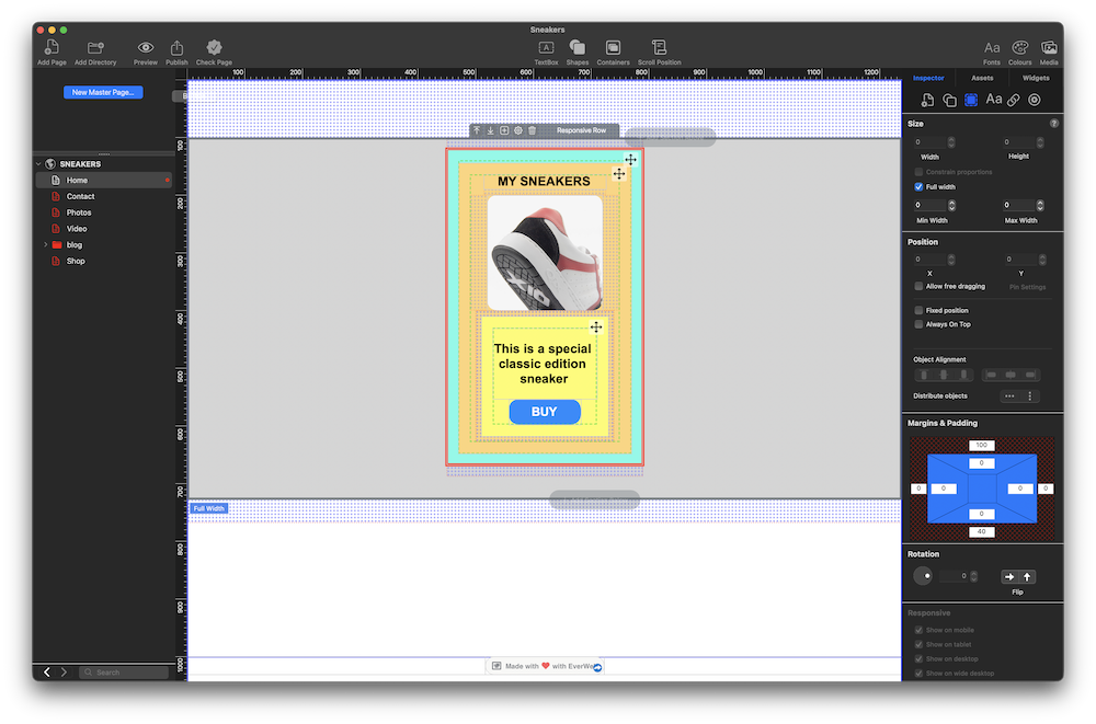
EverWeb’s new Container feature is a powerful design tool, especially when used in the Responsive pages of your site. Introduced in EverWeb 4.4, Containers let you create horizontal, vertical and free format designs easily, with more flexibility than ever before, allowing you to add more features that you want, taking what you conceive into reality on your page!
A Container is an object that contains objects within it. In this post, we will explore one design possibility, other possibilities are down to your imagination!
The Design Concept: Creating a ‘Call To Action’ Container
Our design has two goals to achieve: The first is to explore EverWeb 4.4’s new Container feature, whilst the second goal is to create a ‘Call To Action’ (CTA). The image at the top of the post shows these goals in action. which is to create a Container that contains an item for sale, and a buy button which is our Call To Action. The aim of the CTA is to encourage our visitors to click on the button to purchase the sneaker shown in the image in the Container.
Containers: A Quick Overview
Although you can use Containers in a fixed width environment, we recommend using them in a Responsive Page Layout as this is where their full potential can be realized.
Adding a Container to a page in your site is easy, just click on the Containers button in the Toolbar. Note that there are also other ways of adding Containers to your page.
There are three types of container:
- Container Row – Use this Container type then you want to organize objects horizontally
- Container Column – Use this Container type when you want to organize objects vertically
- Container Free Flow – Use this Container type when you want objects arranged in a free format way
You will also see that the Responsive Row widget is also listed. This widget is included here as it is another form of container that you can add to your Responsive page design.
Additional Container Features
All Containers have a Toolbar positioned either above center or below center, depending on where the Container is on the page. The Toolbar accesses various Container settings. For example, use the Settings Cog to name the Container. You can also set the alignment of objects inside the Container Row or Container Column types. If you find that you want to change the Container type, you can do that as well. Any objects in the Container will automatically adjust.
You will also notice that all containers have a Move icon in their top right hand corners. This compass type icon helps you drag and drop containers without mistakingly moving their contents.
Nesting Containers
Containers are versatile so can be added in to a Responsive Row widget, and can also be nested inside each other, so if you need to you can, for example, have a container within a container with in a container. This will give you a lot more design options. Before starting any design, we recommend that you look at its purpose and how to structure it from a design perspective. For example, you do not want to over design so that you have more nested containers than you need. Keeping your design ‘efficient’ will also mean it will work better, and quicker as it uses less code, when you publish your site later on.
Creating a ‘Call To Action’ Container
In this example, we are going to create a design that will incorporate an image, text and a button which will be our ‘Call To Action’ to encourage our visitors to click on. In. this post, please refer to the image above to see what we are aiming for.
For this design we are using a Responsive page, so either create a new responsive page for your site, or use an existing one.
The next step is to add a Responsive Row widget to the page where you want to add the Call To Action container. Click on the Containers button in the Toolbar, then choose the Responsive Row menu item. Alternatively, go to the Widgets tab and drag and drop the Responsive Row widget on to the page.
A Responsive Row will be added to the page. The next step In our example is to add a background color to the widget. To do this, first make sure that the widget is selected on the page. Next, click on the Shape Options tab. If none of the settings are activated, you will need to select the Responsive Row widget to activate them. In the Fill section, click on the dropdown menu which is set currently to ‘None’. In our example we are going to use Color Fill, and choose a light grey color from the color swatch.
Now that we have our full width widget with a light grey background, we can add margins and padding. to the Responsive Row. This will make the Responsive Row and the objects it contains look better on the page, especially when the page is built out to completion. To add top and bottom margins, use the Metrics Inspector.
In the Margins and Padding section, set the top and bottom margins to 40, using the top and bottom outer fields to do so. You will see a grid appear above and below the Responsive Row when you apply the margins.
After adding the margins, we will add some padding to the inside of the Responsive Row. Using the inner box of settings in the Margins and Padding section, add padding of 20 pixels to all of the sides of the Responsive Row.
We can now proceed to add a Container inside the Responsive Row. In this example, we are going to use a Container Column as this suits our design best.
Adding and Styling Objects In The Container
First make sure that the Responsive Row is still selected. Click on the ‘+’ button in the center of the Responsive Row. A menu will appear. Click on the Container Column menu option A Container Column will be added inside the Responsive Row.
This Container will be the ‘background’ on which objects such as TextBoxes, images and shapes will be placed on top of. So we will first color this background Container, in the same way as did for the Responsive Row widget. using the Color Fill option in the Shape Options tab. In this example, we are using a pastel green color.
Next we are going to change the margins of the Container. Make sure the Container is selected, then go to the Metrics Inspector and change the margins from the default setting of 20 to 10.
We are also going to name the Container as it will make it easier to reference it later if we need to. To do this, click on the Settings Cog in the Containers Toolbar then choose the Name option. In our example, the Container will be called ‘Sneaker One’. Click on OK to finish. You will see that the name of the object has changed in the Toolbar.
We want the Container to be wide enough to be displayed on mobile devices. To change the width of the Container, go to the Metrics Inspector, and set the width of the Container to 320 pixels.
You may find that as you add objects in to a Container that its width changes automatically, so check every so often that the Sneaker One container remains at 320 pixels wide. Readjust the Container width as necessary.
Now we are going to add a second layer to the Container. Click on the ‘+’ button in the Sneaker One Container. From the menu, choose Container Column. Again, we are going to change the color of this Container. This time use the Color Fill menu in the Shape Options tab to set the color to a pastel orange. Name the Container ‘CTA Background’.
Adding Text, an Image and a Button To The Container
We now have the background style for the Container Sneaker One set up, we can now add an image in to the CTA Background container. This will be an image of the product that we are selling, in this example, a sneaker.
Again, click on the ‘+’ button inside the Container, then choose ‘Image’ from the menu. Alternatively, click on the ‘+’ button in the Container’s Toolbar. A placeholder image box will appear inside the Container. To add the image of the sneaker that we want to the Container, go to the Shape Options tab in the Inspector Window and click on the Choose button in the Fill section. Select the sneaker image that you want to use. Resize the image within the Container if you want to.
As we are going to be adding more objects in to the ‘CTA Background’ Container, we will take the time now to add a bottom margin of 10 to the image. Use the Metrics Inspector to do this in the same way as we did earlier.
After adding the Image to the Container, we can add a text title above the image. To do this, we will add a TextBox in to the CTA Background Container. First, we will make sure that the CTA Background Container is selected.
Click on the CTA Background Container’s + button in its Toolbar. Choose TextBox. A TextBox will appear. Replace the default text ‘Enter Text’ with the title text that you want, then style the text as desired, preferably using a Paragraph Style. Make sure that you resize the TextBox itself so that it fits properly within the Container. Drag and drop the TextBox so that it sits above the image if required. To finish, set the bottom margin of the TextBox of 10 so there is enough space between the TextBox and the Image beneath it.
Adding a CTA Button
The last objects to add to the Container are a text description below the image, and a Call To Action button.
Click on the CTA Background Container to select it. Next, click on the + button in its Toolbar and choose Shape, then the Rectangle shape. This will be added to the objects inside the CTA Background Container. If the shape is not under the image, drag and drop it so that it is. Next, change the color of the shape’s background. In our example, we made this yellow, and we also rounded the corners of the shape using the Borders settings in the Shape Options tab.
Set the width of the rectangle shape so that it is the same width as the image.
Within the rectangle shape, we are going to add a some text. Click inside the yellow rectangle shape and type in a description of the sneaker. Remember that shapes can always include text inside them. When finished style the text as desired, preferably using a Paragraph Style to do so.
The last step we need to take is to add the CTA button to the CTA Background Container. Select the CTA Background Container if it is not already selected. Use the + button in its Toolbar to add a rectangle shape, which will be used for the button. Style as rectangle shape as desired so that it looks like a button. Add a hyperlink to the button text which will take the visitor to a payment page, or a more information about the sneaker page.
Remember to add a top margin to the button (or a bottom margin to the text description shape) one you have to finished styling the button.
Check to make sure that the outermost container, Sneaker One, is still 320 pixels wide.
The design is now complete. Preview, before publishing, to test.
 Twitter
 Facebook
 Youtube
 Blog RSS