
Creating a Navigation Menu with EverWeb’s Containers: Part Two
February 26th, 2026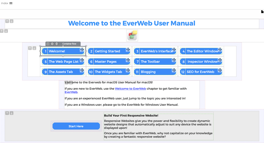
In the first part of our post on Creating a Navigation Menu using EverWeb’s Containers feature, we designed a button using two rectangle shapes. The button will be used as the basis of our navigation. The two rectangle shapes making up the button were customized and lined up side by side. The rectangle on the left side is used for the chapter number with the right hand rectangle being used for the chapter title.
In this post, we will next add our completed design in to a Container. Then we will tweak the design so that it looks like the button you see in the image above. We will then work with EverWeb’s Containers feature to get our navigation completed, tested and published!
Hyperlinking The Button
Now that we have the text within each of the our rectangle shapes, we set up a hyperlink to the page we want. In this case it would be to the Welcome! Page in our site. In this example, we are not going to hyperlink the chapter number, just the chapter title text. Highlight the text ‘Welcome!’ in the right hand side button then go to the Hyperlinks Inspector. Click on the ‘Enable as Hyperlink’ checkbox to activate its settings, Next, check that the Link To field is set as ‘One of my pages.’ If it is set to e.g. ‘An external page’ change this to ‘One of my pages.’ Next, go to the Page field and set the page to your Welcome! page. Adjust the Hyperlink Formatting colors and underlines to suit your navigation. In this example, we are going to keep the Normal and Visited colors the same and not have any of the hyperlinked text underlined as this will spoil the look of our button. There is another way in which we can highlight the button when we need to…
Using Shape Options: Fill
We can draw attention to the button when a visitor hovers over it, or clicks on it, by using the Shape Options Fill feature. If the text is still highlighted, click on an area in the Responsive Row instead. The rectangle should become selected, If not, click on the right hand button. Now go to the Shape Options tab in the Inspector. In the Fill section, change the ‘Normal’ menu option to ‘Mouse Over’. In the field below, which is set to ‘None’ by default, change this to Color Fill. Next, choose a color that you want to use for when your visitors mouse over the button. Remember that the text color should remain readable when you do so. Once you have selected your mouse over color, try mousing over the button to see it working.
Adding the Button in to a Container
The button is now complete. We will be using this button as our template for all of the others that we are going to use in our navigation, so make sure you have completed all of the styling that you want before you continue.
As we always want to keep the two parts of the button together, we are going to put them together in their own container. First, select both of the rectangle shapes. Once you have done this, right click over one of the shapes. A pop up menu will appear. Mouse down to the Contain As… menu option, then Choose the ‘Row’ option. The buttons will now be contained inside their own Container!
Styling the Container
The Container will take the full width of the Responsive Row, and you will also see a dashed line inside the container which is the 20 pixel padding which is added by EverWeb when you create a container. To start, we are going to reduce the width of the button container. Go to the Metrics Inspector and uncheck the Full Width checkbox. You will now be able to access the Width setting for the Container. Change the value to 250 pixels. This should give you enough space for the Chapter button text. If not use a value that is appropriate to the longest text that you are going tp use. Sometimes, though, it is better to shorten the button’s title rather than having too long a title. In this instance it is a good idea to think as if you were designing a menu using the Navigation Bar widget.
The second thing to look at is also the height of the button. Make sure that there is enough space so that the text looks comfortable inside the button. Not too squeezed and not too much dead space. In our example, using an 18 point font, we decided that a button height of 58 pixels was good.
As the button is comprised of two parts, we also want to make sure that there is a clear, but small division, between the right hand side of the chapter number rectangle and the left hand side of the chapter title rectangle. We can set how much of a gap we want using EverWeb’s Padding and Margins options.
Setting Button Padding and Margins
To add some spacing between the two rectangles, select the Chapter Title rectangle. Next go to the Metrics Inspector. In the Margins and Padding section, set a left margin (the outer left field) to two. This should be enough to create a nice gap between the two parts of the button.
Now we turn our attention to the Container itself. Here the default padding is set at 20 which for our navigation is too much. To change this, click on the container itself then change the padding from 20 to 10. Finally, select the Responsive Row itself and set its left and right margins to 30 and its top and bottom margins to 20.
Completing the Navigation
The navigation is almost complete. The final step is to select the button Container and duplicate it eleven times so that you have the twelve menu items required in the scenario. Here you can just copy the button container, then paste it 11 times in to the Responsive Row.
Change the chapter numbers and chapter titles as required. Don;’t forget to also update the hyperlinks for each chapter, so that the visitor will go to the correct chapter!
You can see how the finished result looks by either reducing the width of the EverWeb UI, or by using the Preview button in the Toolbar. The 12 menu items should wrap as you alter the width of the EverWeb UI or browser window. If it does not do this, select the Responsive Row and make sure that Wrap is selected in the Behaviour field.
Our navigation is now complete. use preview to test out your design. Remember to also use EverWeb’s Preview QR Code feature so that you can see how the design looks on a mobile device.
 Twitter
 Facebook
 Youtube
 Blog RSS