
Shape Play with EverWeb!
September 30th, 2016EverWeb includes 13 built in shapes that can be used and customized in a number of different ways to add features and flair to your website. Here are a few tips on getting the best from shapes…
Mouse Over and Mouse Down Effects
Using Color Fill
A good way to draw a visitor’s attention to a particular part of your web page is by changing a shape’s color depending on user behavior. For example, you can change a button shape’s color when it’s ‘moused over’ or ‘moused down’. To create this effect, select the shape you want then go to the ‘Fill’ section of the Shape Options tab. Click on ‘Normal’ and change the setting to either ‘Mouse Over’ or ‘Mouse Down’. Next, change the Fill type from ‘None’ to ‘Color Fill’ and select the color you want. When the user mouses over or mouses down, the button will change color.
Using Image Fill
You can use ‘Image Fill’ as a Fill type to create special mouse over effects. For example, if a visitor mouses over an image, you can use the mouse over effect to highlight certain parts of the image (see the screenshot below). To do this, use an image editor to create an image that contains your text caption. Once you have done this, add an image to your page in EverWeb. Next, add a rectangle shape to your image in EverWeb where you want the text caption to be located. In the Shape Options tab, make the rectangle’s Fill for the Normal state ‘None’. This will make the rectangle invisible. Now change the Fill for the ‘Mouse Over’ state to ‘Image Fill’. Choose your text caption image. Preview or publish the page and mouse over the area where the shape is. The text magically appears!
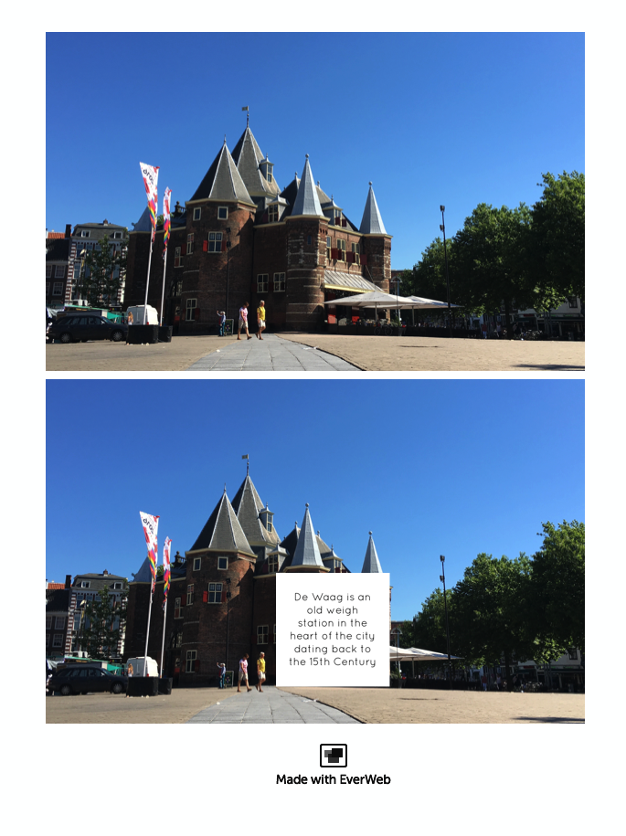
The top image uses a rectangle shape but cannot be seen as the ‘Fill’ for Normal behavior is set to None. In the bottom image, the ‘Fill’ for Mouse Over for the same shape is set to Image Fill. The image used is a piece of text about the building. When the visitor mouses over the rectangle area, the text appears!
Adding Text to Shapes
Remember that you can add text to shapes. This is useful when you want to create a button with a label on it or when using the speech bubble shape! Just double click on the shape and start typing. Use the Fonts Panel to apply font choices and the alignment options in the Text Inspector to center the text vertically and horizontally. Set Before Paragraph, After Paragraph and Insert Margin settings to zero. If using the speech bubble and it’s stem is not in the corner you want it in, use the Flip option in the Rotation section of the Metrics Inspector. This stops your text rotating when rotating the stem.
Creating Special Effects
Create a Pill Shaped Button
Start by adding a rounded rectangle shape to your page. Set the Corner Radius to about 25 in the Widget Settings. Add the text you want and style it using the Fonts Panel. Use the Text Inspector to center and align the text inside the button horizontally and vertically. Set Before Paragraph, After Paragraph and Insert Margin to zero. Use the Line options in the Stroke section of the Shape Options to add a border to the button if desired.
Create Picture Frame Buttons
To create a picture frame effect button, choose the shape you want e.g. a circle. Make the height and width equal and then check ‘Constrain Proportions’ in the Metrics Inspector. Next, go to the Shape Options tab and change Stroke from ‘None’ to ‘Picture Frame’ e.g. in the example screenshot below we used the fourth frame on the first row of picture frames. This produces a circle with a square border. You now have a button which you can use e.g. as a hyperlink to another page.
Combine shapes with picture frames to create button effects easily.
Combine Shapes for Different Effects
Combining shapes can easily create different effects. For example, create a crescent moon effect by adding an oval shape to a black background. In the Metrics Inspector check that the oval shape height and width are equal, then click ‘Constrain Proportions’ to keep the shape as a circle. Fill the circle with a white, or yellow, color using the Color Fill option in the Shape Options tab. Next, duplicate the shape. Change the color fill to black to match the background. Move the duplicate as required so that it overlaps the original circle. This will create the crescent moon effect. Finally select both shapes and group them so you can easily move the crescent moon around the page whilst keeping the effect.
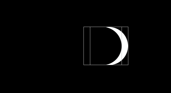
The presence moon is created using two overlapping circles shapes as shown. The background circle is white, the overlapping shape black, on a black background.
Shape Widget Settings
Some shapes have Widget Settings available to them e.g. the Speech Bubble has an option to change the edges to make the bubble more round or square looking. These following shapes have Widget Settings:
Rounded Rectangle
Single Arrowhead
Double Arrowhead
Star
Polygon
Jagged Box
Speech Bubble
Some shapes also have a ‘blue dot’ available when you use them. As you move the dot the shape changes in character e.g. the rounded rectangle can become a circle or even a square edged rectangle. The shapes that have feature a blue dot are:
Star
Jagged Box
Rounded Rectangle
Single Arrowhead
Double Arrowhead
If you ever select the wrong shape, you can easily change it to the shape you want. In the Shape Options tab go to the Shape section. Click on the drop down menu and select the shape you want. The shape changes but retains any settings you may have applied already.
With some thought and imagination, shapes can be extremely useful in your web design. Enjoy!
You can also find EverWeb on Social Media at
Twitter handle @ragesw
If you have any comments, questions or feedback please let us know. We’re happy to help.
 Twitter
 Facebook
 Youtube
 Blog RSS