
Choosing the Best Page Layout Type To Use In EverWeb
September 14th, 2023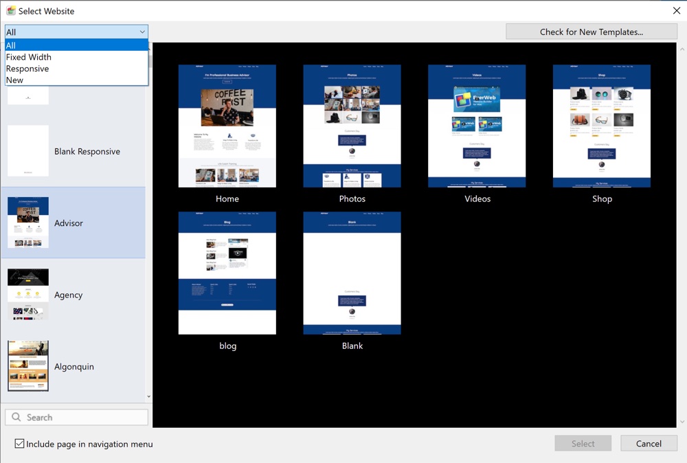
When it comes to designing your page in EverWeb, one of the first choices you will need to make is which page layout style will you want to use? It is an important decision, especially if this your first time building a website. Making the choice that is right for you can save you time, effort and frustration. In this blog post we will explain the page layout types that are available to you as well as the pros and cons of using each type. In this way you can make the best choice for your website project.
EverWeb’s Page Layout Types
When you launch EverWeb for the first time, you will be greeted by the Projects Window which lists all of the website projects that you have created on the right hand side of the dialog box. As it is your first time launching EverWeb, there will be nothing in the list. So you will need to create your first EverWeb Project file by clicking on the large ‘Create a new website’ button. What happens next is that you will see EverWeb’s Theme Template Chooser. This is where you can choose from one of over 200 predefined Themes that you can base your website upon. Alternatively you can choose a ‘blank’ theme if you want to design your website completely from the ground up.
When you look at the list of Theme Templates you will not be able to tell which type of page layout each Theme uses. You can, though, filter on the type of Theme by clicking on the dropdown menu at the top of the Theme Template list. The dropdown has four options: All, Fixed Width, Responsive and New. The default is set to ‘All’ so that you can see all of the Theme Templates that are available. The ‘New’ option shows any new Theme Templates that may have been recently added to the existing themes. For the moment, we are interested in the Fixed Width and Responsive Theme Templates.
Fixed Width and Responsive Themes and Page Layouts
Before filtering the list of Theme Templates, or choosing a Theme Template from the list, it is worthwhile explaining what is meant by ‘Fixed Width’ and ‘Responsive’ themes. or page layouts. if you are not familiar with these concepts already.
When EverWeb was launched back in 2015 it introduced three page layout types: Left, Centered and Dynamic. Of these three, only the Centered page layout is used in EverWeb’s Theme Templates. The other two layout types are very specialized and we would not usually recommend that they are used.
In 2018, EverWeb 2.8 launched, with its main new feature being the introduction of Responsive Website Design. This type of page layout replaced the now defunct ‘Dynamic’ page layout style. The Left Aligned page layout style remains, though, as a legacy layout and is not used at all in Theme Templates or in any EverWeb support documentation.
Essentially you now have two Page Layouts to choose from: The Centered page layout being a Fixed Width page layout and the Responsive page layout having a flexible width layout.
What Is a Fixed Width Page Layout?
In EverWeb, the Centered page layout is, therefore, synonymous with a Fixed Width page layout. As its page layout type suggests, the Centered page layout has a fixed width. The width is defined in pixels and defaults to 1000 pixels wide. If you choose this type of page layout, you can see this information in the Page Layout section of the Page Settings tab of the Inspector Window. Here the Page Layout type will be displayed as ‘Centered Layout’ and the ‘Content Width’ field will have a value of 1000 pixels. The page width is usually suitable for desktop screens, although some users find a width of 980 pixels better to work with. The only problem with this page width is that it does not suit mobile phones or some smaller tablet devices. These devices usually are about half the width (or less) of a desktop screen.
To solve the problem, you should create a fixed width (Centered) page layout specifically for mobile phones to compliment the page you created for desktop devices. If you currently have the Theme Template Chooser open click on the ‘Algonquin’ theme and you will see in the pages list on the right hand side that there is a ‘Mobile’ page available. This page layout has a width of 480 pixels which is suitable for most mobile phones. In EverWeb we can link the two page types together so that you always see the right page layout on whatever device you are using, mobile or desktop.
The Fixed Width, Centered Page Layout type is great if you are new to website design as it allows you to place objects anywhere you like on the page. The downside is that you will probably always have to maintain both desktop and mobile versions of your pages. In this day and age, mobile pages are even more important than desktop pages as people spend most of their time browsing on their phones rather than on desktops. Mobile pages are also prioritized above desktop pages in Search Engine Optimization (SEO).
What Is a Responsive Page Layout?
The Responsive page layout debuted in EverWeb in 2018 and uses a flexible page width that matches any device that the page is displayed upon. If you use this style of page layout, you will see that the Content Width field in the Page Layout section of the Page Settings tab is greyed out as it is not needed. If you have used the Centered Layout before, you may also notice that there is no Header section either on the Responsive page and that the Minimum Header Height field is also greyed out. In Responsive Web Design, the header is not necessary.
All the content that you add to a Responsive page will always be contained within the page’s boundaries. The page boundaries, and the content within it, adjust, or ‘respond’, automatically to suit the device the page is being viewed upon. This means that using a Responsive Page Layout only requires you to make one page layout. You do not need to create a corresponding desktop page for your mobile page. This makes managing your website easier as you have fewer pages to lo maintain and update. The downside, however, is that you must be more careful in how you design your page in the first place. This is often where some experience in website design may help you. For example, your design can become quite complex if you want to show different content on your page for different devices e.g. on a desktop device you can allow yourself more text on the page with fewer images, whereas on a mobile device you probably want more summarized text and more images. Designing a page that accommodates all your requirements, from mobile to desktop, can initially take time and effort, and some trial and error.
Choosing Your Way Forward…
Coming back to our original discussion about choosing a Fixed Width or Responsive design, Theme Template or page layout, we would recommend that if you are brand new to the world of website design that you use a Fixed Width page layout. If you have experience in website design, and/or Responsive Web Design, then a Responsive page layout is for you.
You can always change your mind later on and redesign your website using a different type of page layout if you want. There is no ‘correct’ page layout style that you need to use, just go with what you feel most comfortable using.
Remember too that there are always resources to help you such as the EverWeb User Manual (from the Help menu in EverWeb) which will step you through Fixed Width and Responsive website design. There are also video tutorials on the EverWeb website and on YouTube as well as EverWeb’s User Forum and Support Service.
If you have a question about page layout styles or about anything EverWeb related, please let us know in the Comments section below!
 Twitter
 Facebook
 Youtube
 Blog RSS