
Choosing The Right Page Layout for Your EverWeb Website!
May 23rd, 2025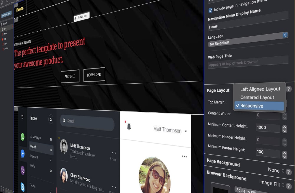
If you are new to EverWeb, one of the first things you will do with it once you have installed the product is to create your first website. Easy enough to do, just click on the ”Create a new website” button!
Once you click on the ‘Create a new website button” you will see the Theme Template Chooser. This is where you can choose the page style that you want from over 200 predefined themes, or choose a blank theme, if you want to design your own website pages from scratch.
EverWeb’s Page Layout Types
Choosing a theme template implicitly chooses the page layout type for you. This can have a fundamental impact on the way in which you design your website, so before selecting a theme template, it is important to understand the implications of doing so.
EverWeb has three built in page layout types:
Left Aligned: This page layout type is one where the width of the page is fixed with the objects that it contains aligned left. This type of page layout is very rarely used and remains in EverWeb for legacy purposes. You will not find any predefined theme templates using this type of page layout within EverWeb. We recommend that you do not use this page layout type, but use either the Centered Layout or Responsive Layout, as described below.
Centered Layout: This type of page layout is the second type to use a fixed width page layout. Objects that you add to the page are aligned at their center. You can change the width of the page layout in EverWeb’s Inspector Window on the right hand side of its User Interface. Click on the Inspector button, then choose the Page Settings tab which is the first button on the left hand side under the Inspector button. You will see a list of Page Settings, including a section for Page Layout. Within this section, you can adjust the page width using Content Width field. By default, this is set to 1000 pixels for desktop type pages and 480 for mobile type pages.
Responsive: The Responsive Page Layout Type debuted back in EverWeb 2.8, replacing the Dynamic page layout type, which in itself was a pseudo-Responsive page layout type. The Responsive page layout is aptly named, as its layout will change, or respond, to match the device upon which it is being displayed upon. As such, you do not need to think about page width or about designing specific pages for desktop and mobile devices. The Responsive page layout makes this unnecessary.
Choosing The Right Page Layout Type….
Essentially you will be choosing between the fixed width Centered page layout type and the Responsive page layout type. Here are some things to be aware of to help you decide what is best for you and for your website.
The Advantages of EverWeb’s Centered Page Layout
1. Pixel-Perfect Design Control
You know exactly how your layout will appear within the defined width, so there will be no surprises from text wrapping or object shifts across screen sizes. This page layout type is great for when you want tight control over object spacing, positioning, and visual hierarchy.
2. Easier to Build and Maintain Than Responsive
This page layout type is less complex compared to Responsive page design, and you do not need to account for differences in layout on different devices. As such, this page layout type is great for smaller projects, or single-device-targeted sites.
3. Works Well with EverWeb’s Mobile Pages
You can easily create a separate tailored mobile version of your site in EverWeb. whilst keeping your desktop fixed-width design in tact.
4. Allows For Fast Prototyping
Fixed width page layouts are often faster to build because you’re not managing breakpoints or fluid containers, so creating mockups for clients is quick and easy.
The Disadvantages of EverWeb’s Centered Page Layout
1. Poor Mobile Usability if you do not Include a Mobile Version
On mobile phones or smaller screens, fixed-width sites often cause horizontal scrolling or squashed views which Google may penalize your site for having poor mobile performance in search results.
2. Inflexible Across Screen Sizes
High-res desktops and large monitors may display a lot of white space on the sides, whilst users with smaller laptop screens may see cramped or overlapping content.
3. Not Future-Proof
As more users browse on mobile and tablets, fixed-width layouts can feel outdated and Responsive design is now seen as the standard and is expected by users.
4. Extra Maintenance for Separate Mobile Site
Maintaining two separate versions of your project, i.e. a desktop and a mobile version, doubles your workload for updates. Responsive layouts reduce this redundancy by using a single, adaptive design.
The Advantages of Using EverWeb’s Responsive Page Layout
1. Mobile-Friendly by Design
Responsive design automatically adjusts your content to fit all screen sizes—phones, tablets, desktops, and large monitors. There is no need to build and maintain a separate mobile version. In addition, this type of design automatically meets Google’s mobile-first indexing standards for better SEO.
2. One Site to Manage
Using Responsive design means that you only need to manage one version of your site instead of having to manage separate desktop and mobile pages. Updating content, layout, or style will be applied immediately across all devices, saving time and reducing errors.
3. Improved User Experience
Your site’s visitors will get a seamless experience on any device. Navigation, images, and text scale appropriately, reducing bounce rates and boosting engagement.
4. Modern Design Standards
Responsive sites feel more up-to-date and professional. They are automatically future-proofed as your site site will be able to automatically against to new device types and screen sizes.
5. Better SEO
Google favors mobile-friendly and responsive websites in search rankings. Also, hainvg one URL per page (instead of needing separate mobile URLs) improves indexing and reduces duplicate content issues.
6. Flexible Design Tools in EverWeb
EverWeb includes responsive features such as specifically designed widgets for responsive design. There is also “Show on Device” which helps manage object visibility across devices, as well as adjustable font sizes As such, you can effectively create complex responsive layouts without needing to code.
The Disadvantages of Using EverWeb’s Responsive Layout
1. Steeper Learning Curve
Responsive design introduces concepts such as breakpoints, containers, and device-based visibility that can be harder to grasp than fixed positioning, especially if you’re used to pixel-perfect layouts, or are new to website design.
2. Less Predictable Layout
As the page layout changes based on screen size, you do not have total control over how every element will appear, for example, text wrapping and spacing may vary more than in a fixed-width layout.
3. More Initial Setup Time
A responsive design typically requires thoughtful planning to ensure content looks good across all screen sizes. You will need to test on multiple devices or use preview frequently to check your design works correctly at all times.
4. Complex Element Positioning
Precision design is harder, especially for overlapping elements or absolute positioning.
Conclusions
If you are new to web design we would recommend starting out with a Centered Page Layout. In this way you can quickly get your website up and running whilst learning how to use EverWeb. Once you have mastered these skills, you can build a Responsive site at a later date using the skills you have already acquired.
 Twitter
 Facebook
 Youtube
 Blog RSS