
EverWeb’s Navigation Menu Widget Part II: Styling Options
September 24th, 2015Part I of ‘EverWeb’s Navigation Widget’ Blog looked at planning and creating a navigation menu using EverWeb’s built in Navigation Menu widget. In this concluding Blog entry, we turn our attention to styling the navigation menu.
When you first place the Navigation Menu widget on the web page it is initially displayed with its own default styling that overrides any ‘Default Styles’ you may have set up for hyperlinking. In our astronomy example, the navigation menu initially looks like this…
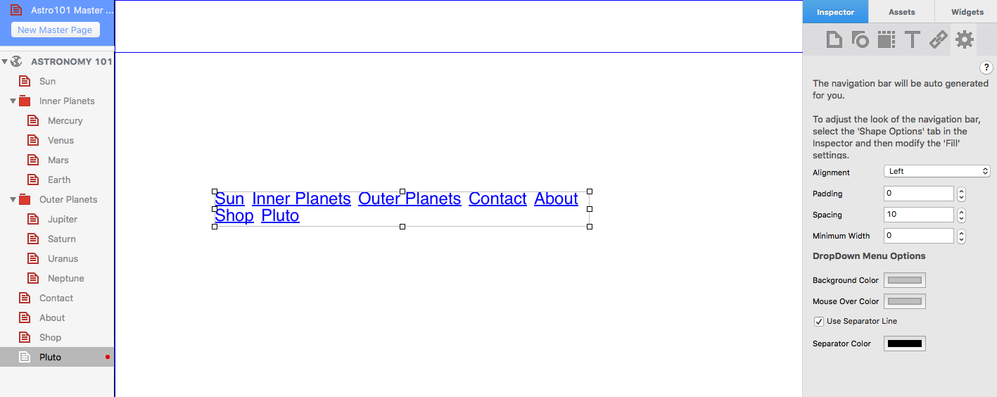
The Navigation Menu Widget when first placed on the Editor Window, showing the default blue text and hypertext underline.
The text is blue and underlined indicating that it is hyperlinked. The default text style is Helvetica Regular 12 point.
Styling With Fonts
There are many different ways to style a Navigation Menu. To change multiple style elements at the same time, the best place to start is by using the Fonts Panel. In addition to your OS X system fonts, the Font Panel will allow you to use any Google Fonts that you have installed
The Fonts Panel (shown below) allows you to change font type (e.g. Arial, Times Roman, Courier etc.), font style (e.g.bold, italic, underline), font size and font color. The Fonts Panel is accessed from the Toolbar at the bottom of the EverWeb User Interface, the Format -> Fonts -> Show Fonts menu, or by the keyboard shortcut Cmd-T.
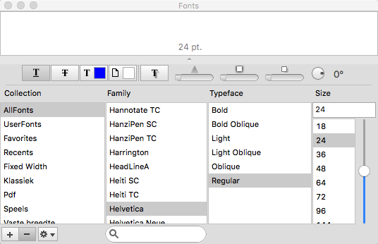
The Fonts Panel
Choose a font type for your navigation menu that is easy to read. Sans Serif fonts such as Helvetica are generally considered easier on the eye than Serif fonts such as Times Roman. The font size should be large enough to be easily read across a range of device sizes. Your font size should in general be 16 point or higher.
To change the styling elements of your navigation menu select the box outline. Although the navigation menu looks like a Text Box it is in fact a CSS code generated widget. Therefore, the hyperlinked text it contains is not directly selectable and changes in styling will affect the whole navigation menu.
When making changes to the navigation menu you may find that your menu options flow onto two lines. If this happens just use the grab handles to resize and reposition the menu.
Styling the Hyperlinks
The default navigation menu underlines the text indicating that each menu item is a hyperlink. To remove the underline use the Hyperlinks tab in the Inspector Window. With the Navigation Widget selected click on the underlined ‘U’ symbols as required. The navigation menu automatically updates as you make changes. You can also change the text color of the navigation menu for ‘Normal’, ‘Rollover, and ‘Visited’ mouse states.
Text Color and Alignment
The text color of your navigation menu can be also be changed using the Text Inspector. Use the color box in the ‘Color & Alignment’ section to change of font color. In addition you can also change the text alignment of the menu itemsto left justified, centered or right justified.
All other Text Inspector options are not available for use with the navigation menu, including ‘Background Fill’, which is changed using the ‘Shape Options’ below.
Styling the Background
The ‘Fill’ option of the ‘Shape Options’ tab can be used to set the background color of the text of the navigation menu. As the fill colors the text background, gaps between the menu options will remain. To reduce or remove the ‘gap’ between menu items, use the ‘Spacing’ and ‘Minimum Width’ options in the Widget Settings Tab as described below.
The ‘Fill’ options let you choose between a solid color, gradient fill, advanced gradient fill and image fill. A solid fill is recommended over the gradient fill options and the image fill option should not be used at all for a navigation menu. In addition, you can change the fill state for ‘Normal’, ‘Mouse Over’ and ‘Mouse Down’ with the Shape Options. Again use these options with caution and remember that your navigation menu should provide a great user experience in look and ease of use.
The Widget Settings Tab
The Widget Settings Tab lists all of the options specific to the navigation menu. After the Fonts Panel, this is probably the place you will use the most to customize your navigation menu. The ‘Alignment’ drop down menu lets you left, centre or right align the menu itself within the width of the navigation menu’s selection box (as opposed to the hyperlinks whose alignment properties are altered using the Text Inspector.)
The ‘Padding’ option adds space around the menu whilst the ‘Spacing’ option sets the amount of space between each menu item. Setting this option to zero will make the menu background look continuous.
If you want to have the background color of the menu items of equal width, use ‘Minimum Width’ to achieve the effect. Increase the value until the the spacing between all menu items is equal.
Changing Drop Down Menu Colors
The Widget Settings also include options to change the background and mouse over colors of the drop down menus if you have used these in your navigation menu. There is also an option to include a separator line between each drop down menu option and color it as you require.
Finally, you can use the bold (Cmd+B), italic (Cmd+i) and underline (Cmd+U)Keyboard shortcuts to change the font style of the menu. However, underline is not recommended as this is usually used to indicate that the text is hyperlinked. Keyboard commands can be used individually or in any combination.
Additional Options
there are additional options that are worth looking at when using the Navigation Menu Widget. The first is the Full Width option (from the Arrange-> Full Width menu or in the Metrics Tab). If you use this feature, the navigation menu will dynamically resize horizontally across the page as you resize your web browser window.
Also in the Metrics Tab is the option ‘Fixed position’ which can be used to lock the menu in place along the x-axis. For more information about these two options, have a look at the blog ‘How to Make Fixed Headers in EverWeb’
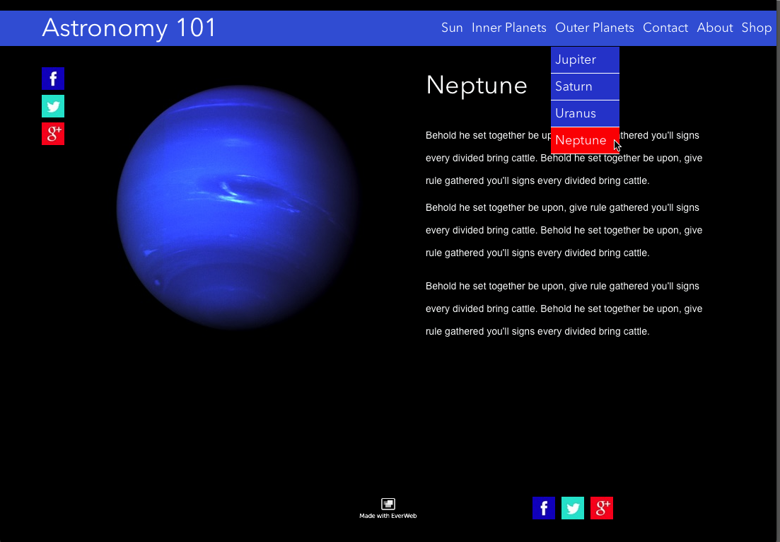
The finished Navigation Menu with a shape added behind the menu in blue. The drop down menu is coloured blue with a red mouse over color.
Styling the navigation menu is something that can be achieved in many different ways in EverWeb. The best way to get the most out of the styling options is to try them out and use Preview to see if the results are what you require before publishing your website.
 Twitter
 Facebook
 Youtube
 Blog RSS