
How To Make A Device Specific Responsive Page in EverWeb
April 18th, 2023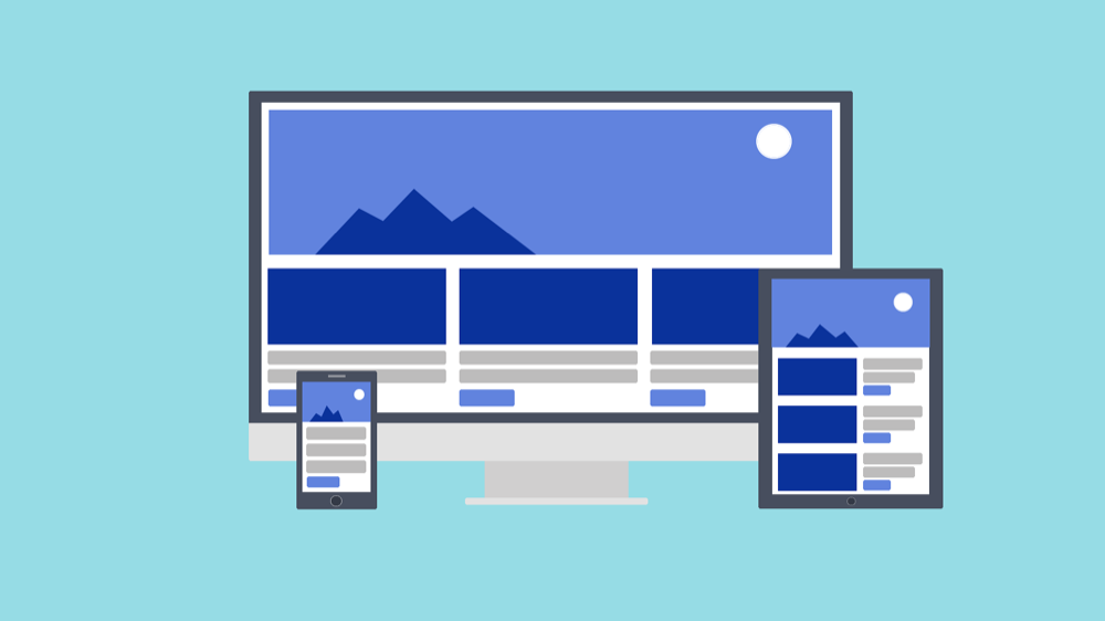
Building a Responsive website in EverWeb takes away the hassle of having to design both desktop and mobile versions of the pages in your site. Whilst responsive website design means that you only have one page design to deal with, it does mean that you have to be more aware of the state of the page at every pixel width. This can mean that pages are inherently more complex to design than the traditional desktop-mobile design paradigm.
Designing responsive pages may also mean that you want to display different content at different pixel widths. For example, you may want super detailed text content when viewing a page on a desktop or large desktop device, but on a mobile device you may want more images and a text summary instead. At any point inbetween these two devices types you might want the content to ‘scale’ accordingly…
Structuring a responsive page to suit all device type typically relies on just a few of EverWeb’s widgets. Typically you will be working a lot with the Responsive Row, Text Section and FlexBox widgets as these help you to scale your page easily at all pixel widths. You may also want to use TextBoxes, images, shapes and perhaps video or audio as well in your page design.
Things get complex, however, when you want to change the content as the page width changes. Whilst the aforementioned widgets enable you to structure your content at any pixel width, they won’t add or remove content along the way. So how can you achieve this? The answer lies with EverWeb’s ‘Show on Device’ feature.
Show On Device
The concept of EverWeb’s Show on Device feature is a simple one: to display an object only for the selected device type(s). Usually an object is displayed on all device types, but Show on Device, located in the Responsive section of the Metrics Inspector, allows you to display the selected object on any combination of mobile, tablet, desktop and large desktop device. This feature is used in a Responsive website design using fixed width objects within a Responsive Row widget.
To use Show on Device, place the objects you want to use in to a Responsive Row widget. This widget is used as a container for the widgets placed within it. Also make sure that the objects that you place in the Responsive Row widget are set as fixed width objects i.e. the ‘Full Width’ checkbox in the Metrics Inspector is unchecked for objects inside of the Responsive Row widget.
You may want to start creating your device specific Responsive Row using a large desktop scenario. This is perhaps easiest to start with as you can put all of the content (text, images, video, shapes etc.) that you want in to your objects within the Responsive Row. You can later duplicate this and remove content for other device types later.
When creating the first Responsive Row set the title of the Responsive Row in the Widget Settings to something along the lines of ‘Large Desktop Row’ so you can easily identify the row. If using widgets, such as the FlexBox or Text Section widget, check the Widget Settings to make sure that they conform to settings appropriate with a large desktop e.g. image size, maximum width settings, objects width settings within the Responsive Row widget. If you are using TextBoxes, shapes or images, check in the Metrics Inspector that the width of these objects is, again, suitable for being displayed on large desktop devices.
Once you have completed filling the Responsive Row widget with the content you want, uncheck the Show on Desktop, Tablet and Mobile options in the Responsive section of the Metrics Inspector for the all of the objects within the Responsive Row. To test that the Responsive Row works properly, you can use the Preview button and then reduce the width of your browser until the objects disappear. You can also do this in EverWeb. As you reduce the width of the app, you will see the objects in the Responsive Row being replaced with boxes with an ‘X’ through them. This denotes that the object would no longer be visible at that screen width when previewed or published.
Once you have tested that all works properly, duplicate the Responsive Row widget and its contents so you have two copies of the Responsive Row and the objects it contains. In the Metrics Inspector, check ‘Show on Desktop’. Uncheck ‘Show on Large Desktop’ for all the objects in the duplicated Responsive Row.
You can now use the duplicated version of the Responsive Row to build a version for desktop devices. For this version, first change the title of the Responsive Row to e.g. ‘Desktop Row’. You may want to trim some of the text content from the objects or even remove some objects altogether from the Responsive Row. You may also need to adjust the maximum width of objects within the Responsive Row to suit the maximum width of a desktop device. Once you have completed your work on the desktop version of the Responsive Row, again test. After testing is completed, duplicate the Destop Row and its contents, this time for use on a tablet. Repeat the process and once complete do the same procedure for Mobile devices.
At the end you should have four Responsive Rows, one for each device type. As you expand or reduce the width of the EverWeb app or browser window, you should see each version of the Responsive Row displayed. You may find that you may not need some device types or that you can use on Responsive Row for two device types e.g. the Desktop Responsive Row may be fine to sue for both Desktop and Large Desktop device types. In this example, you would delete the Large Desktop Responsive Row and check ‘Show on Large Desktop’ and ‘Show on Desktop’ for the Desktop Responsive Row instead.
Show on Device is a very useful design feature, but can require some thought and finesse when using it.
Using this feature will complicate your page design when editing your page in EverWeb, so take it slowly and test your page design regularly. Check out our video walkthrough above for extra information on this useful EverWeb feature!
In our next blog we will look at some hints and tips for getting the most out of Show on Device! If you have a question about this feature, or anything about EverWeb, please let us know in the Comments Section below.
 Twitter
 Facebook
 Youtube
 Blog RSS