
EverWeb’s Show on Device Feature: Hints and Tips
April 27th, 2023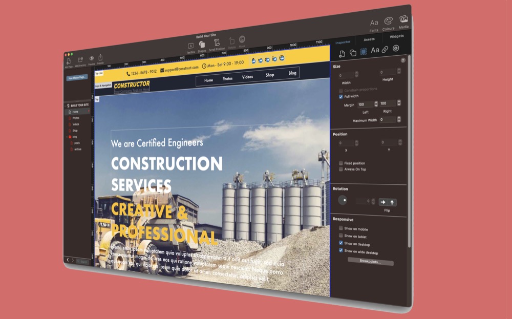
In our previous post we looked at how to use EverWeb‘s Show on Device feature so that you could use one page in your website to create content that is tailored to the device it is being displayed upon. In this post, we will look at some of the useful tools built in to EverWeb to make designing your page as easy as possible.
When to Design a Page Using Show On Device
The Show on Device feature is designed to be used on responsive pages. Whilst you can use Show on Device on a center aligned page, there is not much milage ion doing so. As the center aligned page is fixed in width,. for this type of design style you would create a mobile page version of the desktop page and then link them together in the Inspector Window using the Mobile Settings section of the Page Settings tab.
Responsive pages are typically more suitable for using Show on Device, as the page type is designed to scale at any width. Designing responsive pages using Show on Device can, however, become quite complex, both visually and technically. If your page uses Show on Device for each page device type on a page, you could have four times the objects than if you did not use Show on Device at all.
For most website designers, using Show on Device will be on a ‘case by case’ basis. Typically the widgets that you use on the page, such as the Responsive Row, FlexBox and Text Section widgets will cater for most website designers needs. If you do think that you need to use Show on Device for specific needs then here are some hints and tips to help you develop our website’s pages more easily…
EverWeb’s Scaleable Editor Window
It is easy to forget that if you change the size of the EverWeb app on your computer, you will also affect the size of the Editor Window. This is the simplest and quickest way in which to view how your page will look at different pixel widths.
Use EverWeb’s Rulers To Assist in Your Page Design
If you are using EverWeb 2.9 or later, you turn on the option to show a ruler along the top and down the left hand side of the Editor Window. Use the Window_> Show Rulers menu option to toggle this feature on or off. Using rulers can help you guide the width of your objects as you design you page. In this way you can better see how the page will look at any pixel width
Use ‘Show Breakpoints’ to See Device Widths
In addition to seeing how your objects can look at different device widths within the Editor Window, you may also find it useful to use the Window-> Show Breakpoints menu option to see the demarcation line between different device types.
Decluttering Your View
The most probable cause of most frustration when using Show on Device is that your Editor Window can be come very cluttered. This can make editing a more difficult task. However there are some things that you can do to help…
- Use Pick Layer to Choose the Object You Want: When using Show on Device, you may find that you have objects appearing on top of other objects as your design now has more ‘layers’. If you find that you now have difficulty in selecting the right object, you will find Pick Layer indispensable. Just right or secondary mouse click on the object you want to select. You should now see a submenu from which you can choose ‘Pick Layer’. Select the object that you want to select.
- Where to Embed Your Objects: When adding objects to suit all the different device types, you may find that sometimes you have added an object to the wrong Responsive Row. You can move misplaced objects by first using Pick Layer to select the object you want to move. Then right click again on the selected object and use the ‘Embed In’ menu option and place the object in the correct Responsive Row widget.
- Name Your Responsive Rows: This is another simple, but useful, tip. When you are designing for up to four different device types all on the same page, naming each Responsive Row widget properly so you can easily see whether it relates to a Large Desktop, Desktop, Tablet or Mobile becomes becomes more important. To do this, just select the Responsive Row that you want to name, then go to its Widget Settings and enter an appropriate name in the ‘Responsive Row Name’ field.
- Use Show Hidden Objects: When using the ‘Show on Device’ feature, when an object is not viewable at the pixel width the EverWeb app is currently set to, the object will be greyed out with an ‘X’ through it. Only when the Editor Window is at the right pixel width will the object be visible. To be able to see the contents of objects that are not currently visible, use the Window-> Show Hidden Objects menu option. The object contents will appear under the greyed out object. This menu option can be toggled on or off as required.
- Using Show Layout: There may be times where you want to view the contents of the Editor Window without seeing the layout. This is useful when you want to get an idea of how your page will look without having to preview. use the Window-> Hide Layout menu option. Again you can toggle this command to show the layout again as needed. If your hidden objects are still visible, toggle the Window-> Show Hidden Objects menu option.
Working with Show on Device can really make your website more dynamic. Once you get used to how the feature can be applied, and by using the tips above, you will be able to take your website to a new level!
 Twitter
 Facebook
 Youtube
 Blog RSS