
EverWeb’s Responsive Web Design Primer
June 9th, 2023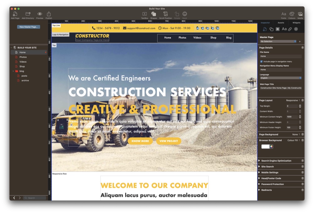
For the last few years, responsive web design has been the must have feature for website designers and EverWeb introduced this feature back in version 2.8. The goal of responsive web design is that you only have one page design which automatically adapts, or responds, to whatever device the page is displayed upon. Since its inception, responsive web design has become the standard for designing websites, but this does not mean that it is suitable for everyone’s needs…
Challenge, Complexity and Simplicity
Responsive Web Design successfully solves the challenge of the ‘one page fits all’ design challenge, but does so at a cost. The most cited cost is that it is more complex conceptually and also in implementation. It is certainly a different design paradigm that can lead to a frustrating design experience. Over the years, however, software developers have improved the tools that they create to help website designers build responsive websites. For EverWeb, the goal was to find a way to implement responsive web design in a way that you could still use EverWeb in the same way as you would building a center aligned page. The result is what you see in EverWeb today – the same experience whatever page design you choose to use.
If you have been an EverWeb user for a while, you may also have noticed that the tools used for creating Responsive pages in EverWeb have also evolved over time. Widgets have gained new and enhanced features to help making designing responsive pages easier, and other features have gained responsive capabilities. This is a continuously evolving and exciting process.
One of EverWeb’s own goals is to make designing the site that you want as easy as possible. So with that in mind, here are some tips to get you more comfortable about designing your first responsive website!
Rethinking Page Width
When you choose a theme template with a responsive page layout, you will notice that the ‘Content Width’ setting in the Page Layout Section of the Page Settings tab is greyed out. This is because a responsive page always takes up 100% of the width of the device it is being displayed upon.
There may be times, however, where you will want to limit to how wide an object can be on your page. You can use the Maximum Width setting in the Metrics Inspector to limit how wide an object can be.
You will probably also want to set a left and right margin on your page, which you can easily do, again using the Metrics Inspector’s Left and Right Margin settings in the ‘Size’ section.
Why There Is No Header on the Page
You may also have noticed that there is no Header section on the page and that the ‘Minimum Header Height’ section in the Page Layout section of the Page Settings tab is also greyed out. In responsive pages the header is just another full width object on the page, just placed at the top of the page, so it does not need to be treated in any special way.
Getting to Know Full Width and Fixed Objects
If you are new to Responsive website design, you may get thrown straight away when you add your first object to the page. For example, if you add a TextBox to the page, you will find that it takes up the full width of the page, which may, or may not, be what you wanted… A full width TextBox is probably great for a title, heading, or subheading on your page. Just add left and right margins from the Metrics Inspector and style your title text and you are finished! The same technique can then be applied to the body text of your page as well.
There might be instances where this may not be the solution you want, especially if you want to combine text with images, shapes, buttons and other media or objects. In this case, you should experiment with using widgets that easily let you combine such objects e.g. the Responsive Row, Text Section or FlexBox widgets.
Horizontal, Vertical and Freeform Perspectives
One thing that is very obvious with responsive websites is that all content is laid out horizontally in rows. Even if you see content displayed vertically in a column, this type of content will actually be structured within a row. Responsive website design is a structured approach which is needed so that the objects on your page can scale, and fit, properly at any page width.
If you are used to a more freeform approach in web design that is offered by EverWeb’s Center Aligned page layout, you may find responsive design restrictive. In reality, responsive web design is just structured as opposed to freeform. You can build a responsive website with a lot of flexibility and flair, it is only the design approach that is different, Designing successful responsive websites usually requires rethinking the way in which you design your site as well as using EverWeb’s responsive widgets which will help you creatively.
Keeping Everything In The Box
One of the keys to working successfully with responsive design is to remember that everything needs to fit inside ‘the box’ at all times. The box is the web page your are viewing. It is a flexible box so that you can easily change its height and width, which is exactly what you do when resizing your browser window.
Each row in your page is also a box which takes up the whole width of the page. As you change the browser with, each row will dynamically resize itself to suit the new outer box size. These rows can contain content (such as text, shapes or images), or may also contain boxes within themselves, for example, the FlexBox widget or Responsive Row. These boxes will, again, typically hold content.
So Responsive Web Design is analogous to working with flexible boxes within boxes within boxes. The main problem with this comes when page designs create boxes which are too large for the box they are wrapped in. If you create such a design then your page may at times, be too wide for the device it is being displayed upon. If you find yourself in this situation, check out our Solving Horizontal Page Drift video which explains how to easily fix the problem.
Conclusion
Working in a responsive web design environment may mean that you have to ‘think different’ and is a learning process too. It may not suit everyone’s needs but it is the best way to create a scalable site easily.
If you have a question about building a responsive website in EverWeb please let us know in the Comments Section below. We would love to hear about your experiences!
 Twitter
 Facebook
 Youtube
 Blog RSS