
Learning About Responsive Website Building Through EverWeb’s Theme Templates
May 16th, 2024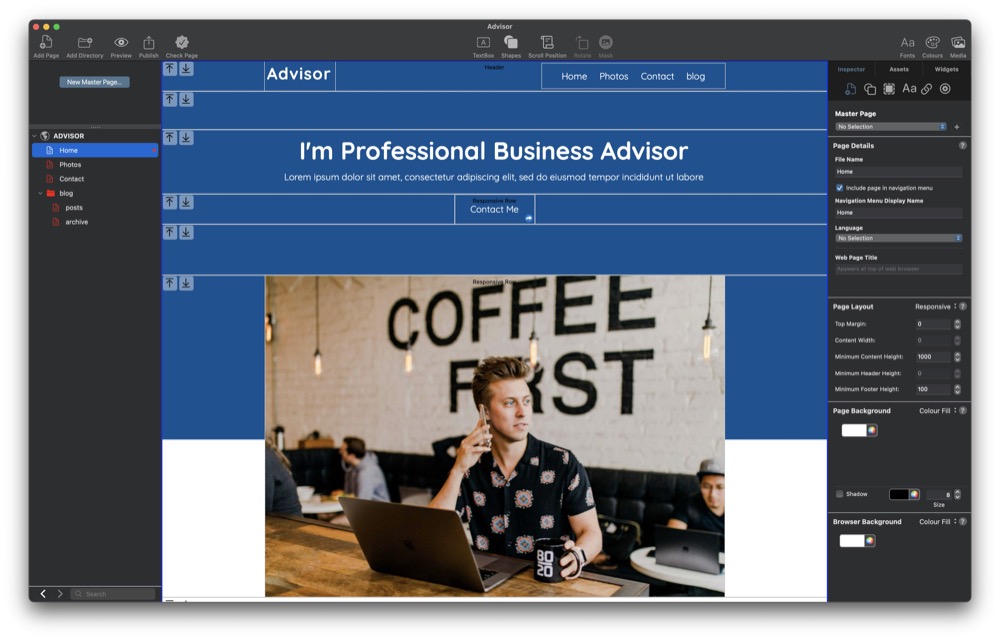
Creating your first website is an exciting experience but it can also be a daunting one for the inexperienced. EverWeb makes designing and building your website as easy as possible, with drag and drop capabilities meaning that you do not have to code to be able to create the site that you want.
Website building is full of choices, and perhaps the most crucial one coming before you begin building your site’s first page. What type of website should you be building? This may seem a strange question if you are completely new to website building. In EverWeb, there are two types of website that you can build. We use the terms ‘fixed width’ and ‘responsive’ to describe these two types of websites.
A Fixed Width type website is a free form type of website where you can drag and drop objects such as images, text, shapes etc. anywhere on your work canvas. You can freely move objects around the page to wherever you want. It is a great way to start if you have never built a website before. The downside to this type of website is that because the pages are ‘fixed width’ you will have to design pages for desktop devices and corresponding pages for mobile devices. So you double your page count and will have to maintain two sets of pages.
The second type of website is ‘Responsive’. The difference between this type of website and a fixed width one is that a responsive site’s design is more structured, rather than free form. Responsive websites also automatically respond to the type of browser their pages are being displayed upon, so you only need one page design and not two. As a result, there should be less maintenance of your site’s pages to do in future, but the design process itself can be more challenging than if you were designing a fixed width site.
Learning Using EverWeb’s Theme Templates
Some EverWeb users start by building a fixed width website then later on redesign their website as a responsive one. This makes sense if you have no website building experience and also if you are new to EverWeb. It also means that you get your site up and running quickly and get more experience with EverWeb at the same time.
When it comes to creating a responsive website, you can use the skills that you have already acquired to create your responsive website. To get familiar with how a responsive website works, you could download one of the responsive theme templates that comes with EverWeb and look at how the theme template has been designed. For example, create a new project from the Projects Window in EverWeb then add the Home page of the Advisor template to the new project. When the page is added to the new project, click and drag the right hand side of the EverWeb app to the left and right. You will see the page change in the Editor Window as you do so. Objects move and change to conform automatically to the width of the page. Notice also that these objects are contained within bands across the page.
Let’s start with the band at the top of the page. This is named ‘Header’. Inside the ‘Header’ are two objects’: A TextBox that contains the word ‘Advisor’ and a Navigation Menu widget. The ‘band’ in which these objects are located within is a Responsive Row widget. As you narrow the width of the EverWeb app, you will notice that the Navigation Menu widget changes from a standard menu structure to a Hamburger menu. Double click on the Navigation Menu widget then scroll down its Widget Settings. You will notice in the Responsive Options section that ‘Responsive Navigation Bar’ has been checked and that it is set to ‘Appear at Width’ of 700 pixels or less.
Next let’s take a look at the third row of the page. This is a TextBox containing the page title (“I’m a Business Advisor” and some subheading text. Note here that the text goes right across the width of the page. When you reduce the width of the page, the text automatically repositions itself so that it always fits the width of the page. Click on this TextBox, then go to the Metrics Inspector. You will see that the ‘Full Width’ box has been checked.
Next let’s move on to the fourth row of the page. In this row you will see a TextBox with ‘Contact Me’ as its text, together with a hyperlink embedded within a Responsive Row widget. Compare this to the full width TextBox above it. In the ‘Contact Me’ row, we do not want the TextBox to be full width. Click on the TextBox then click on the Metrics Inspector. You will see that the TextBox is just 157 pixels wide. This is wide enough to be displayed properly in any browser window on any device. This also gives us our first example of a fixed width object on a responsive page. When designing your own pages, be careful if you have fixed width objects within a Responsive Row widget. The width of the fixed width object should not be too large that it causes the page to scroll to the left and right. As a guide, make fixed width objects only have a maximum width of about 350-400 pixels.
The next row of interest is the Responsive Row containing the image. Click on the image to select it then go to the Shape Options tab. Here you can see that the image has been set up as Scale to Fill. When adding images to your own responsive page, you may need to experiment to see which type of image fill is best to use, as the best option to choose usually depends on the image itself.
Next click on the Metrics Inspector. You will notice that the image is set as a full width object. Also note, though, that the maximum width of the image has been set to 900 pixels wide. In this way, the image will not become too large if you increase the width of the page.
The other interesting point to note about this Responsive Row is that its background colors are blue and white. To see how this has been created, click on the blue-white area to select the Responsive Row itself, then go to the Shape Options tab again. You will see now that the fill is an Advanced Gradient Fill with blue occupying one side of the fill and white on the other.
Under the image, is another Responsive Row widget, this time containing a TextBox on the left hand side, with two Text Section widgets to the right of the TextBox. The TextBox has a width of 375 pixels and each Text Section widget a width of 280 pixels. In this row, the Text Section widget combines text and an image to create an effective display. Note also how all three objects change as you change the width of the page.
The final row we are going to look at is the one directly below the Life Coach Training full width TextBox. This row is in fact a FlexBox widget that contains three Embedded objects. FlexBoxes, like Text Section widgets are very useful tools to use in Responsive page design! Take a look at the FlexBox’s Widget Settings. Note that each text/image embedded object combination has a maximum width of 335 pixels. Again, this means that the object will not be too wide for a mobile phone’s browser which typically is about 400-450 pixels wide.
Conclusion
Using a Theme Template is a great practical way to see how a responsive page has been created. If you create a test website as we did above, you can create safe environment where you can try out using a responsive theme template without any risks. This also give you the freedom to experiment to see what works and what does not work and to get familiar with designing responsive pages before tackling your own website.
Don’t forget to also check out the EverWeb User Manual and our videos on YouTube. If you have a question, you are always welcome to ask us here on this blog, or on the EverWeb User Forum.
 Twitter
 Facebook
 Youtube
 Blog RSS