
Getting Started with EverWeb’s Responsive Row Widget
July 11th, 2025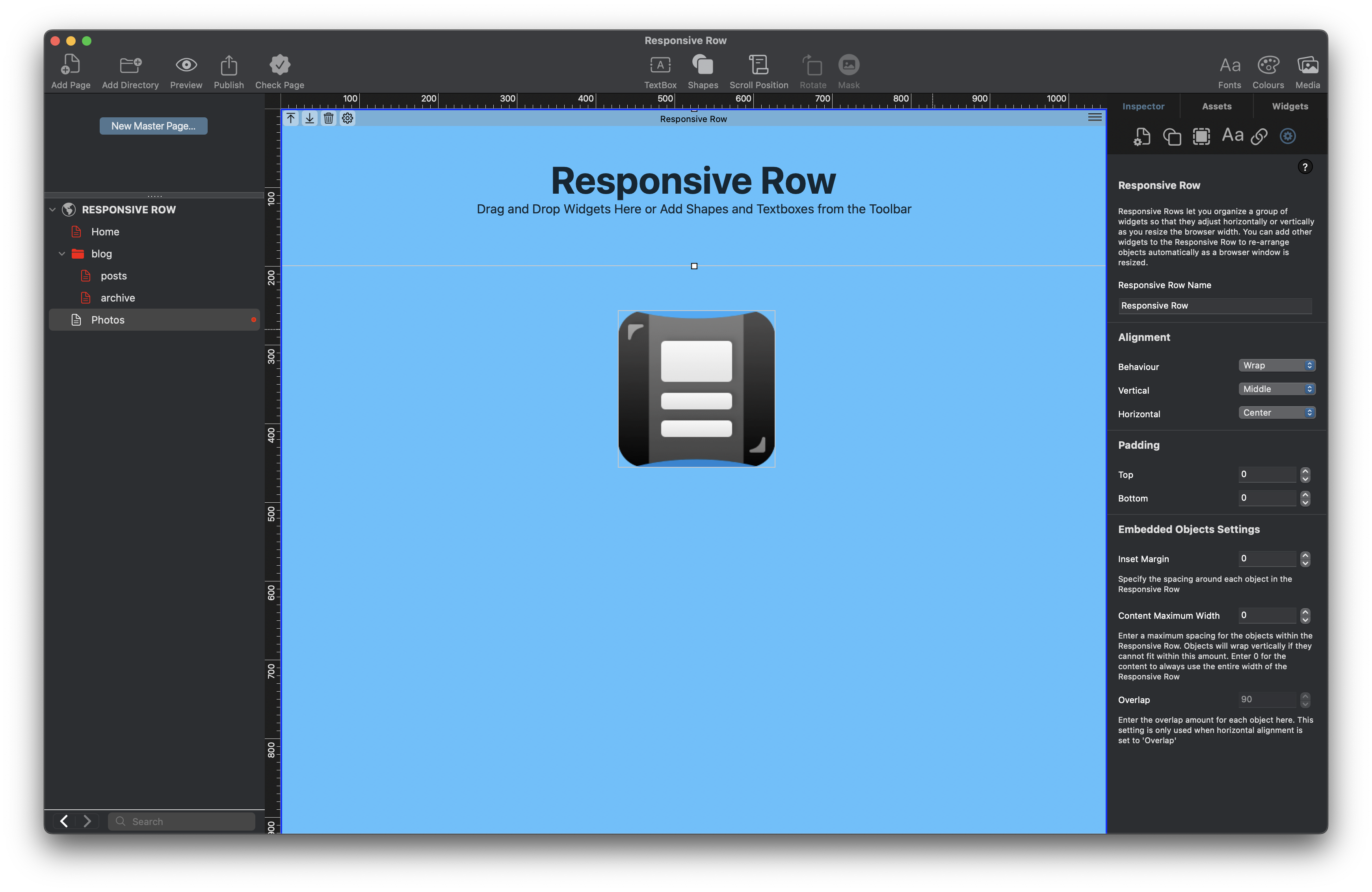
In today’s web design world, responsiveness is essential. With users browsing on phones, tablets, laptops, and desktops, your website needs to adapt to every screen size. One of EverWeb‘s best tools for responsive layouts is the Responsive Row widget
First debuted in EverWeb 2.8, the Responsive Row widget was part of a larger debut, Responsive Website Design in EverWeb. That was back in back in 2018 and much has happened in the intervening years, with the upcoming EverWeb 4.4 release taking the next leap forward in responsive design. So remember to check back here over the next couple of months for more news!
What Is the Responsive Row Widget?
The Responsive Row widget is a layout tool that helps you arrange content horizontally in a way that automatically adapts to different screen sizes. Think of it like a flexible container for your content —TextBoxes, images, shapes, buttons, widgets and so forth. When the screen size gets smaller, the Responsive Row adjusts by wrapping or stacking the items inside it, so that there is no manual resizing needed!
Why Use the Responsive Row Widget?
There are a number of reasons for using the Responsive Row widget in your site”
- Responsive by default – Your content looks great on all devices.
- Drag-and-drop simplicity – Build layouts without writing code.
- Full control – Adjust spacing, margins, alignment, and wrapping behavior.
- Combine with other widgets – Use it with FlexBox, Text Section, or other responsive widgets for powerful layouts.
When Not To Use The Responsive Row Widget
Whilst the Responsive Row widget to use in Responsive Web Design, it is not always necessary to include it in your page design. Remember that when you are creating your page designs in EverWeb, when you come to publish your site, your design gets converted to code. If you use design elements that are not needed in your pages, your code will become less efficient. The following is a list of when you do not, or should not, use the Responsive Row widget in your pages:
- When You Are Using A Fixed Width, Center-Aligned, Page Layout: If your page is not a Responsive Page Layout i.e. you are using a center-aligned layout, we do not recommend using the Responsive Row widget at all. In this layout style, elements are positioned manually and do not resize or stack for mobile devices so responsiveness isn’t a factor.
- When You Only Need One Full-Width Object: If you’re adding a single object such as a full-width TextBox, image or Navigation Menu widget it is likely that you do not need a Responsive Row to hold it. You can set that object’s width to Full Width in the Metrics Inspector, and it will stretch across the screen on its own. It is a common trap to add a full width object in to a Responsive Row widget when it is not needed.
- When You Are Using Widgets That Already Handle Responsiveness: Some widgets, such as the FlexBox, Text Section, or Responsive Image Gallery widget are already designed to be responsive on their own. If you’re using these, placing them inside a Responsive Row is optional—and sometimes unnecessary. Check the EverWeb User Manual for more details.
How to Use the Responsive Row Widget
- Add the Widget To The Page: From the Widgets tab in the Inspector Window, drag and drop the Responsive Row widget onto the page. you will see the Responsive Row widget on the page together with information on how to use it.
- Add Content Inside the Responsive Row: Once the widget is on the page drag and drop text, images, buttons, or other widgets in to the widget.
- Moving Objects Inside the Responsive Row: You can easily move objects inside the Responsive Row to a different location. Just drag and drop the object you want to move to its new location. As you do this, a blue vertical guide bar will display to help you correctly locate where to drop the object being moved.
- Deleting Objects from the Responsive Row Widget: To delete an object from the Responsive Row just select it then press the backspace key on your keyboard
- Moving Objects Outside Of The Responsive Row: You can move and object outside of a Responsive Row if you need to e.g. you may want to move the object in to another Responsive Row. In this case, just drag and drop the object from one Responsive Row to the other. There may also be times where you want to remove the object completely from the Responsive Row e.g. you might want to move a TextBox outside of the Responsive Row. In this case, right, or secondary, click on the object (in this example, the TextBox) then select the option ‘Remove from Responsive Row’. When you do this, the object becomes a fixed width object ‘floating’ on the page. In our example, the next step would be to go to the Metrics Inspector and check the ‘Full width’ box so that the TextBox becomes responsive.
- Moving the Responsive Row itself: As you build your Responsive page, you will have rows of full width objects that from time to time you may want to re-order. Use the Up/Down arrows attached to these full width objects to move them up and down the page.
- Adjust Settings: Use the Widget Settings and Metrics Inspector to:
- Set top and bottom margins and padding
- Choose left, center, right, justified, justified-center or overlap alignment
- Enable or disable wrapping
- Control how content flows as the screen resizes by setting the Maximum Content Width value as desired.
- Preview Your Page: Use the Preview button to test your design on different screen sizes.
More Tips on Using The Responsive Row Widget…
We have looked at the basics of the Responsive Row widget in this post, but there is more to discover… Here are some tips to help you further:
- Break your page into multiple Responsive Rows for better control.
- Keep each row focused—avoid placing too many items in one row.
- Combine with Full Width settings for edge-to-edge design.
- Use the FlexBox and Text Section widgets as fixed width objects inside a Responsive Row for complex layouts.
- Check out Show on Device for those times where you want to hide content e.g. you may want to hide a TextBox on a mobile device if its content is too long.
- Check out the Responsive Websites chapter in the EverWeb User Manual for more information.
Next Steps…
If you want to build clean, modern, mobile-friendly websites in EverWeb, the Responsive Row widget is essential. It’s simple to use but incredibly powerful when used right.
Whether you’re designing a product page, portfolio, or homepage, learning how to use EverWeb’s Responsive Row widget will improve your site’s performance and user experience across all devices. There will be also be more responsive tools coming in EverWeb 4.4 for macOS and Windows, so stay tuned for some exciting developments!
 Twitter
 Facebook
 Youtube
 Blog RSS