
Working With Responsive Pages in EverWeb
January 17th, 2019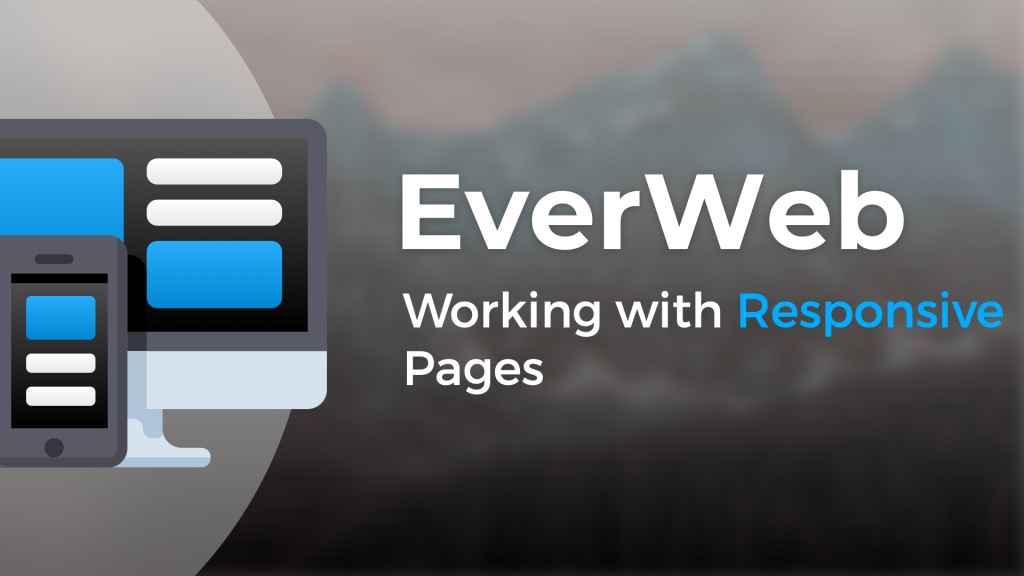
EverWeb’s Responsive Page Layout has many ways in which you can work quickly, easily and effectively to achieve the page design you want. Responsive website design means that you can immediately create a web page for desktop, tablet and mobile devices using just one page design. The challenge, however, is to make sure that what you create looks great on whatever device you are viewing the page upon.
Fortunately EverWeb makes this challenge easier for you as its Responsive Page Layout, widgets and other features introduced in version 2.8 are designed specifically to do as much of the work for you whilst still giving you design freedom. There is, of course, some learning required along the way and knowing about the background to responsive design in EverWeb will help in your responsive website design if you are used to creating only fixed width web pages. Here are some tips to help get you started on building a great page design suitable for all device types:
- Use EverWeb’s application boundary: By dragging the right hand vertical edge of the EverWeb application left and right, the page layout will adjust in the Editor Window so you can see how the page will look on all device types before previewing or publishing;
- Widgets: EverWeb 2.8 updated many of its existing widgets so that they can be used as full width objects on a responsive page. The Navigation Menu widget was also updated with Responsive features that can be applied to both fixed width and responsive page layouts. The PayPal widget, which is a fixed width widget, was updated too introducing product image and product description features making the widget even more indispensible for both fixed width and responsive pages.
- New Responsive Widgets: EverWeb 2.8 introduced the Responsive Row, Text Section, FlexBox and Responsive Image Gallery widgets. These new widgets are extremely flexible in what they actieve so exploring what is possible with each is highly recommended. You can also find out more about their capabilities on this blog and on our YouTube channel.
- Compatibility: Nearly all of EverWeb’s fixed width features can be used in a responsive website. There are a couple of exceptions such as Scroll Position and Picture Frames and Line frames. These features may gain compatibility wth responsive design at a later date.
- Blogging: Many websites include a blog and it is easy to create a responsive blog in EverWeb. Just add a page to your website and select the ‘blog’ page style from the Blank Responsive Theme Template. Many of EverWeb’s other Responsive Theme Templates also include a blog page style. If you have an existing fixed width blog, this can be converted to a Responsive blog by changing the ‘Page Layout’ in the Page Settings tab. If you choose this option you will need to reorganise the blog afterwards. Also be aware that changing the page layout cannot be undone, so it is recommended that you backup your Project file first and then duplicate the blog so that you have a copy to try the new page layout on.
- Margins: Use the Margin option in the Size section of the Metrics Inspector to add left and right margins to full width objects. Other margin options are also available such as the Insert Margin option in the Text Inspector for use with TextBoxes and the Padding option in the Navigation Menu widget. You can also use the Responsive Row widget to add top and bottom margins to sections of your page using its Top and Bottom Padding options. As there are a few different ways to add margins to a Responsive page layout, you may want to experiment to see which works best for your page.
- Adding a Background: Many responsive websites use alternating background color bands to separate sections of the page. This makes it easier for the user to find and focus on content. To add a background color band, add a Responsive Row Widget to the page then use the Color Fill option in the Metrics Inspector to add the background color (or image if you prefer) of your choice. Add your content in to the Responsive Row widget to create the section of the page that you want.
- Pick Layer and Embed In: These two options are really useful in responsive design in EverWeb. When you secondary click in the Editor Window you will see these two options listed in the submenu that appears. When you have two or more objects stacked on top of each other (e.g. a FlexBox widget on top of a Responsive Row Widget) use Pick Layer to select the layer that you want. Use the Embed In option when you have a full width object that you want to embed in to a Responsive Row widget.
- Testing: As part of any website development process, you should always test your website as much as possible before going live. This is especially true for responsive page designs as such pages scale to the device they are being displayed upon. You may find for example that objects on desktop device look fine but are too close to one another on a mobile device. Conversely, your mobile device may display the page perfectly, but on a desktop there is too much white space between objects. In these instances you will need to work with the objects on the page to find an appropriate solution. This may mean using padding options in a Responsive Row widget or a Flexbox widget instead of a Text Section widget and so on…
- Keep Up to Date: As of this blog, EverWeb version 2.8.8 is the current public release. If you have not updated to this release, you can do so using the EverWeb-> Check for Updates… menu option, or download a new version directly from the EverWeb website. We have lots of great new Responsive features coming soon in the forthcoming EverWeb version 2.9 release, which will make responsive web design even easier and better!
In the next instalment we will look at testing your responsive website and how this can be done in the most effective way.
If you have any questions about this post, please let us know in the Comments Section below.
EverWeb on Social Media
You can also find EverWeb on the following social media platforms:
Twitter handle @ragesw
 Twitter
 Facebook
 Youtube
 Blog RSS