
Get To Know EverWeb’s FlexBox Wrapping Feature
August 4th, 2023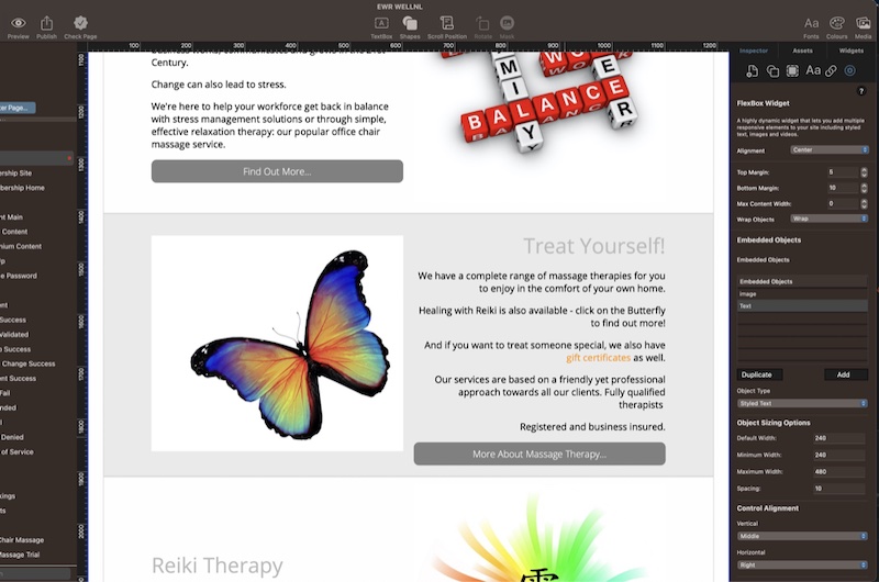
Building your own website with EverWeb is easy to do and should be a rewarding, creative experience. If you are creating a fixed width website, you have great design freedom as this type of website allows for a free format design approach. When creating a responsive website, though, you may need to more time to find solutions to design problems due to the nature of responsive web design.
In this post we are going to look at an example of a responsive website using EverWeb’s Responsive Row and FlexBox widgets.
Scenario
In this example, I want to design a page containing five section. Each section will have an image and some text side by side. Under the text will be a button that my visitors can click upon to take them to another page. The five sections on the page alternate between text on the left, image on the right and text on the right, image on the left. On mobile devices, though, I want the image to always be above the text and button.
Designing the First FlexBox
In my responsive page design I first add a FlexBox widget to the page. The widget uses two Embedded Objects: the first is a Styled Text’ Object type which contains my text and a button which links to another page in my website. The second Embedded Object Type is an ‘Image’ object which contains only an image. In this example, the default and minimum widths for both objects is set at 240 pixels with a maximum width set to 480 pixels. Spacing is set to 10 to give a bit of a gap between the two Embedded Objects.
The first FlexBox widget will also have ‘Wrap Objects’ set to ‘Reverse Wrap’. This is set this way so that on mobile devices the Image object will appear above the Text object.
When setting up the FlexBox widget, consider setting a top and bottom margin so that there is spacing between each widget as you add them to the page.
To finish off the work on the first FlexBox, next go to the Metrics Inspector and add a left and right margin e.g. 30 pixels each. Also check to make sure that the Full Width field is checked.
The first FlexBox widget is now complete. In the Editor Window the text is displayed on the left hand side with the button underneath it and the image on the right. There is also a 30 pixel margin on either side of the FlexBox.
Cloning The FlexBox Widget
Now that the first FlexBox widget is finished, copy it to the Clipboard then paste it in to the page again to create the second section of the page.
In this section, you only need to change two things: First set the ‘Wrap Objects; field to ‘Wrap’, then change the order of the Embedded Objects so that the Image object first in the list and the Text object second in the list. When you do this, the image will then appear in the Editor Window on the left with the text and button appearing on the right. Change the image, text and button link to be what you want them to be for the second section of the page.
For the third FlexBox widget, I simply copy and paste the first FlexBox widget and move it to under the second FlexBox widget if needed. Again, change the image, text and button link as required. Repeat the same process to create the fourth and fifth FlexBox widgets on the page.
The FlexBox Page in Action
Once all of the five FlexBox widgets have been added to the page, Preview the page to see how it looks and works. If your browser has a responsive design mode, you can see how each section of the page has the image on top, text under the image then the button at the bottom of the section. Using a desktop browser, you will see sections alternating with image left, text and button right, then image right, text and button left and so on…
Extra FlexBox Widget Styling
Creating sections to separate out your content may make you want to add in some extra styling to visually differentiate one section from another. To add styling to a section, select the FlexBox widget that you want to style, then go to the Shape Options tab. From there you can use the Fill options to choose a background color, or color gradient for the section. You can also use EverWeb’s Dividers feature to create specific top and/or bottom visual section separators!
EverWeb’s FlexBox widget is a super powerful tool that lets you be creative and saves you time as well in the design process. And EverWeb’s Fill Options and Dividers feature also help you add flair to your page design too!
If you have a comment about this blog post, please let us know in the Comments Section below.
EverWeb on Social Media
You can also find EverWeb on the following social media platforms:
 Twitter
 Facebook
 Youtube
 Blog RSS