Sticky Navigation for Responsive Websites in EverWeb

Thursday, February 6th, 2020

Creating a navigation menu is one of the core features of most websites, making it easy for website visitors to navigate the pages within the site. EverWeb includes the Navigation Menu widget for just such a task. The widget is extremely customizable as shown in the Navigation section of the Video Tutorials page of EverWeb website. There are also third party Navigation Menu widgets available, e.g. from everwebwidgets.com, if EverWeb’s built in widget does not suit your requirements.

One important requirement when using a navigation menu for many website developers is that it remains at the top of a page whilst the visitor scrolls the page. In this way, the navigation will always be visible.

If you have created a fixed width website (i.e. one that uses a Centered or Left Aligned page layout), check out our Creating a Sticky Navigation Menu video, which shows you how to easily create this effect.

If you have a responsive website and want a sticky navigation, read on…

Set Up: Use a Master Page

It is always recommended that you use Master Pages in your website so that you only need to add your navigation once to your website. Any page using a Master page will inherit its navigation. As EverWeb’s Navigation Menu widget is so customisable, you will only want to set it up once. If you change the style of the Navigation Menu widget at a later date in Master page, all the pages that use the Master Page will be automatically updated. This is a great time saver as you do not have to update every page in your site with the same change.

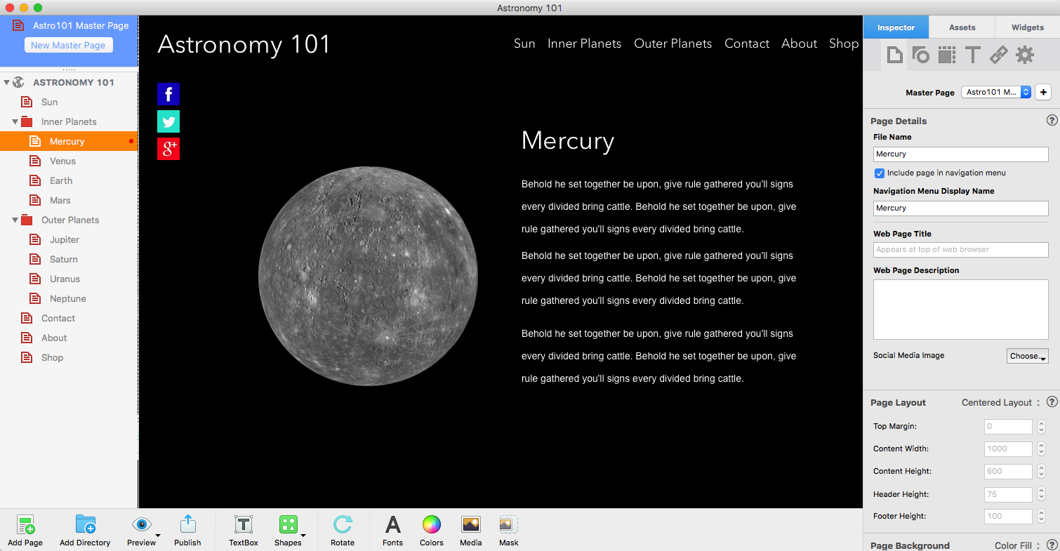
Creating The Master Page

In this example, start by creating a responsive Master page:

  1. Click on the ‘New Master Page’ button in the Master Page section of the Web Page List. This section is colored blue at the top of the Web Page List above the name of your website. If you are using Dark Mode, the area is colored black. If you do not see the ‘New Master Page’ button, drag the splitter bar (the row of dots above the name of your website) down until the button becomes visible.
  2. Once you have clicked on the New Master Page button, the Theme Template Chooser will appear. Choose the ‘Responsive Blank’ theme from the list of Theme Templates on the left of the dialog box. Click on the ‘Home’ page style and click ‘Select’ to finish.
  3. A blank new Master Page will be added in to the Master Page List. The page will be called ‘Home’, you can rename it as you would any other page in the Web Page List by double clicking on its name, entering a new name, then pressing Enter to finish.
  4. You can always check to make sure that you have created a responsive page by checking the Page Layout section of the Page Settings tab in the Inspector Window. I

Adding The Navigation To The Master Page

Now that you have created a Master Page, keep it selected. The next step is to add the Navigation Menu widget to the page.

  1. Click on the Widgets tab and drag and drop the Navigation Menu widget on to the page.
  2. As this is a responsive page, the widget will automatically display at full width. As this is the first object placed on the page, it will be appear at the top of the page.
  3. The Master page footer contains the ‘Made with Love with EverWeb’ image. You can remove this if you do not need it and add your own content if you want.

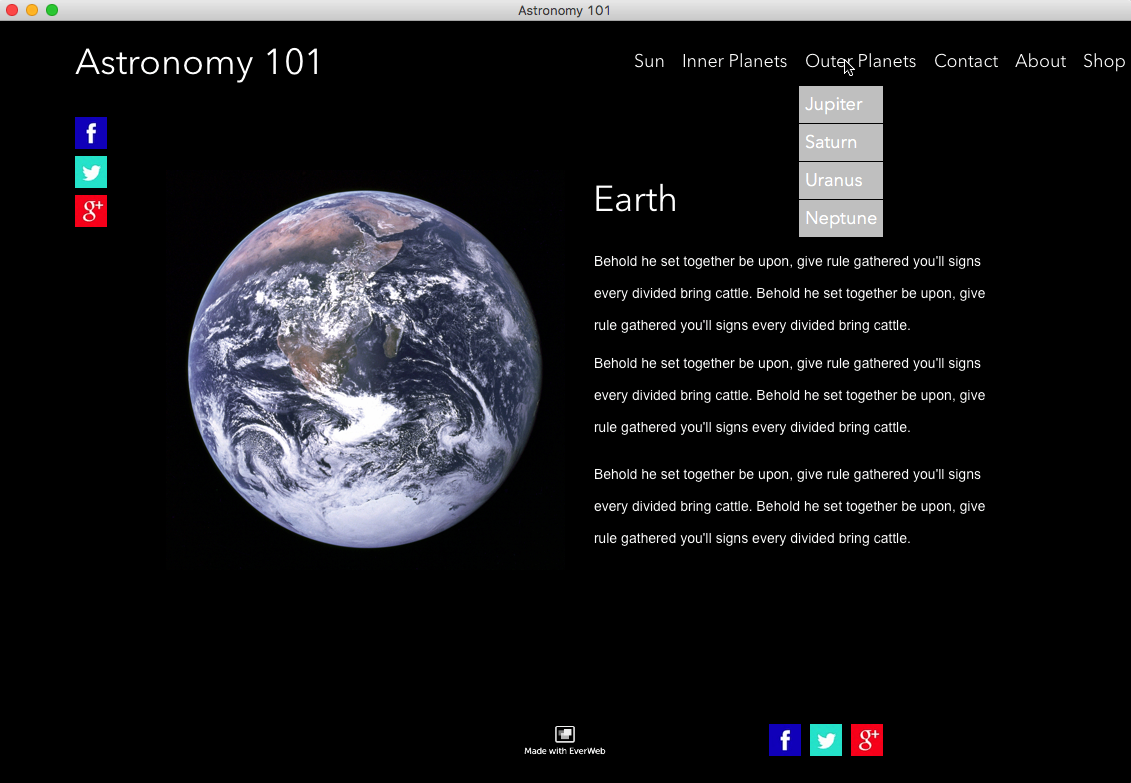
Making the Navigation Stick

Now that the Navigation Menu widget is in place on the page, it is time to make it stick so that content will be able to scroll underneath the navigation when the page is scrolled.

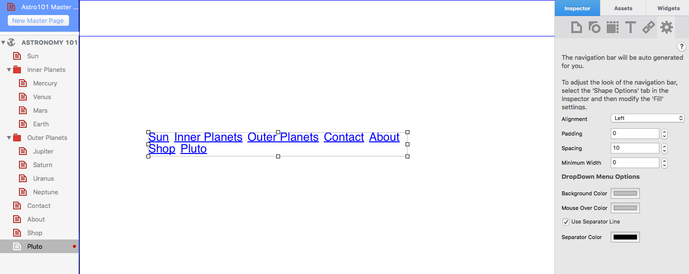
  1. In the Widget Settings of the Navigation Menu widget, tick the ‘Use Background Color’ checkbox and add a background color to the navigation using the ‘Background Color’ color swatch. This step will stop the contents of the page from being visible under the navigation when you scroll the page.
  2. Next, go to the Metrics Inspector and make a note of the Height of the Navigation Menu widget, e.g. by default this is usually 50 pixels.
  3. In order for the sticky navigation to work, you will need to place a dummy rectangle shape on the page. Create a new rectangle shape using the Shapes button in the Toolbar.
  4. The rectangle will be created as a full width object directly below the Navigation Menu widget.
  5. Change the color of the shape to match the color of the background of the navigation. To do this go to the Shape Options tab whilst the shape is selected. In the ‘Fill’ section change the color of the ‘Color Fill’ using the color swatch.
  6. Next, change the height of the shape so that it is the same as the height of the Navigation Menu widget. To do this, go to the Metrics Inspector and change the Height field in the ‘Size’ section to 50 pixels.
  7. Now that the changes to the rectangle are complete, reselect the Navigation Menu widget and go to the Metrics Inspector.
  8. Tick the ‘Fixed Position’ box. This will pin the navigation menu widget in place. Leave ‘Relative to browser left’ ticked
  9. When you select ‘Fixed Position’ for the Navigation Menu widget, you will notice that the rectangle shape below it slides underneath it. When using Fixed Position on a full width object in a Responsive page, it is as if the object becomes a layer above the page. 
  10. As content in responsive pages has to be in continuous sections down the page, we need to fill the space below where the navigation was. If we do not do this, when we use the Master Page on a regular page, part of the regular page content may be obscured underneath the navigation.
  11. This is the reason why the dummy rectangle shape is needed and created with the same height as the Navigation Menu widget to fill the gap where the navigation menu would have been if it had not become its own ‘layer’.
  12. Finish styling the Navigation Menu widget as you want and add the other objects you want to the Master page as desired.

Finishing Tasks

Once you have finished styling he Master Page

  1. Select a regular page in the Web Page List to attach the Master Page to.
  2. In the Page Settings tab of the Inspector Window, click on the dropdown menu in the Master Page section and select the Master page that you have just created.
  3. The Master Page will be attached to your regular page.
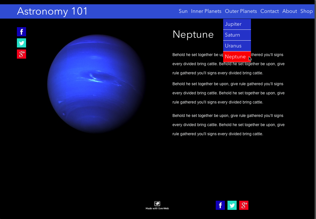
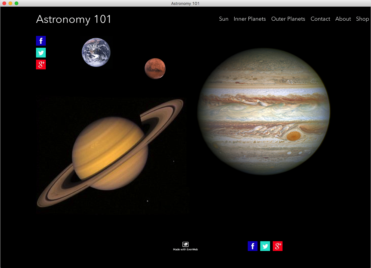
  4. Scroll the contents of the page to see them slide under the navigation.
  5. Use Preview to test out the sticky responsive navigation.

As this is a responsive page, the navigation will automatically on mobile devices. To display a Hamburger Navigation icon when on using the navigation on mobile pages, select ‘Responsive Navigation Bar’ in the widget settings of the Navigation Menu widget.

Video Walkthrough

You can also enjoy a video walkthrough of this blog post in our YouTube video Responsive Sticky Navigation Menus.

If you have any questions or comments about this blog post, please let us know! We’re happy to help!

EverWeb on Social Media

You can also find EverWeb on the following social media platforms:

Facebook

Flipboard

YouTube

Twitter

Instagram

EverWeb’s Navigation Menu Widget Part II: Styling Options

Thursday, September 24th, 2015

Part I of ‘EverWeb’s Navigation Widget’ Blog looked at planning and creating a navigation menu using EverWeb’s built in Navigation Menu widget. In this concluding Blog entry, we turn our attention to styling the navigation menu.

When you first place the Navigation Menu widget on the web page it is initially displayed with its own default styling that overrides any ‘Default Styles’ you may have set up for hyperlinking. In our astronomy example, the navigation menu initially looks like this…

default menu

The Navigation Menu Widget when first placed on the Editor Window, showing the default blue text and hypertext underline.

The text is blue and underlined indicating that it is hyperlinked. The default text style is Helvetica Regular 12 point.


Styling With Fonts

There are many different ways to style a Navigation Menu. To change multiple style elements at the same time, the best place to start is by using the Fonts Panel. In addition to your OS X system fonts, the Font Panel will allow you to use any Google Fonts that you have installed

The Fonts Panel (shown below) allows you to change font type (e.g. Arial, Times Roman, Courier etc.), font style (e.g.bold, italic, underline), font size and font color. The Fonts Panel is accessed from the Toolbar at the bottom of the EverWeb User Interface, the Format -> Fonts -> Show Fonts menu, or by the keyboard shortcut Cmd-T.


Font Panel

The Fonts Panel


Choose a font type for your navigation menu that is easy to read. Sans Serif fonts such as Helvetica are generally considered easier on the eye than Serif fonts such as Times Roman. The font size should be large enough to be easily read across a range of device sizes. Your font size should in general be 16 point or higher.

To change the styling elements of your navigation menu select the box outline. Although the navigation menu looks like a Text Box it is in fact a CSS code generated widget. Therefore, the hyperlinked text it contains is not directly selectable and changes in styling will affect the whole navigation menu.

When making changes to the navigation menu you may find that your menu options flow onto two lines. If this happens just use the grab handles to resize and reposition the menu.


Styling the Hyperlinks

The default navigation menu underlines the text indicating that each menu item is a hyperlink. To remove the underline use the Hyperlinks tab in the Inspector Window. With the Navigation Widget selected click on the underlined ‘U’ symbols as required. The navigation menu automatically updates as you make changes. You can also change the text color of the navigation menu for ‘Normal’, ‘Rollover, and ‘Visited’ mouse states.


Text Color and Alignment

The text color of your navigation menu can be also be changed using the Text Inspector. Use the color box in the ‘Color & Alignment’ section to change of font color. In addition you can also change the text alignment of the menu itemsto left justified, centered or right justified.

All other Text Inspector options are not available for use with the navigation menu, including ‘Background Fill’, which is changed using the ‘Shape Options’ below.


Styling the Background

The ‘Fill’ option of the ‘Shape Options’ tab can be used to set the background color of the text of the navigation menu. As the fill colors the text background, gaps between the menu options will remain. To reduce or remove the ‘gap’ between menu items, use the ‘Spacing’ and ‘Minimum Width’ options in the Widget Settings Tab as described below.

The ‘Fill’ options let you choose between a solid color, gradient fill, advanced gradient fill and image fill. A solid fill is recommended over the gradient fill options and the image fill option should not be used at all for a navigation menu. In addition, you can change the fill state for ‘Normal’, ‘Mouse Over’ and ‘Mouse Down’ with the Shape Options. Again use these options with caution and remember that your navigation menu should provide a great user experience in look and ease of use.


The Widget Settings Tab

The Widget Settings Tab lists all of the options specific to the navigation menu. After the Fonts Panel, this is probably the place you will use the most to customize your navigation menu. The ‘Alignment’ drop down menu lets you left, centre or right align the menu itself within the width of the navigation menu’s selection box (as opposed to the hyperlinks whose alignment properties are altered using the Text Inspector.)

The ‘Padding’ option adds space around the menu whilst the ‘Spacing’ option sets the amount of space between each menu item. Setting this option to zero will make the menu background look continuous.

If you want to have the background color of the menu items of equal width, use ‘Minimum Width’ to achieve the effect. Increase the value until the the spacing between all menu items is equal.


Changing Drop Down Menu Colors

The Widget Settings also include options to change the background and mouse over colors of the drop down menus if you have used these in your navigation menu. There is also an option to include a separator line between each drop down menu option and color it as you require.

Finally, you can use the bold (Cmd+B), italic (Cmd+i) and underline (Cmd+U)Keyboard shortcuts to change the font style of the menu. However, underline is not recommended as this is usually used to indicate that the text is hyperlinked. Keyboard commands can be used individually or in any combination.


Additional Options

there are additional options that are worth looking at  when using the Navigation Menu Widget. The first is the Full Width option (from the Arrange-> Full Width menu or in the Metrics Tab). If you use this feature, the navigation menu will dynamically resize horizontally across the page as you resize your web browser window.

Also in the Metrics Tab is the option ‘Fixed position’ which can be used to lock the menu in place along the x-axis. For more information about these two options, have a look at the blog ‘How to Make Fixed Headers in EverWeb


Finished Menu

The finished Navigation Menu with a shape added behind the menu in blue. The drop down menu is coloured blue with a red mouse over color.


Styling the navigation menu is something that can be achieved in many different ways in EverWeb. The best way to get the most out of the styling options is to try them out and use Preview to see if the results are what you require before publishing your website.

EverWeb’s Navigation Menu Widget Part I: Adding a Menu

Tuesday, September 22nd, 2015

Almost any website you build will include a way for visitors to navigate from one page to another. The most common way of doing this is by using a menu that is available at all times, on all pages, of your website. Menu structures give your visitors an easy way to find what they want quickly and easily. That’s important because you want to keep your visitor focused so they don’t get distracted, confused, frustrated or bored. If they do they will leave your website and go elsewhere!

Solar 2

Therefore, any navigation menu should have a simple structure, such as a list of web page names that take you from one page to another page. It may also be a drop down list giving you choices that are organised in structured way. Menu structures that have additional menus hanging off the drop down list also exist. However, this type of ‘nested menu’ is less commonly used and is generally avoided. Nested menu structures with more than two ‘layers’ soon become unwieldy and frustrating to visitors. Think of such menu structures as the equivalent of ringing an automated call centre and having to go from one menu to the next to the next to the next. It just becomes frustrating very quickly.

There are times, however, where you may have a specific need for an extra level of menu structure. In these circumstances,  the 3rd Party Products & Announcements section of the EverWeb Discussion Forums may have widgets that are suitable for your needs available for purchse.

EverWeb comes with the Navigation Menu widget built in as standard which is suitable for most menu structure design needs. The widget is feature rich and highly customisable so this Blog will start by taking you through setting up the Navigation Menu widget. The following Blog will specifically deal with Styling and Customisation of your navigation menu and there will also be a special Blog soon to cover Mobile device needs in the near future. So, to begin setting up your navigation menu will take a few steps…

Setting Up Your Menu Structure

When you create a new website project file, you add web pages to it. You will also usually create a Master Page to act as a template that can apply default style and settings to any, or all, of the web pages you create. Master Pages are also where you tend to add in objects such as company logo, social media buttons, copyright notices and your navigation menu. When you first create a Master Page, leave some space to accommodate your navigation menu. You will add the navigation menu later, once you have created some regular pages and structured your Web Page List to reflect how you want to see your menu on screen. A navigation menu is generally placed in the header area of the Master Page, but it’s not mandatory to do so.

With the Master Page ready, create your web pages attaching the Master Page as required. As you create each web page consider whether it is to be included in your menu. If it is, tick the checkbox ‘include page in navigation menu’ on the Page Inspector tab.

Underneath the ‘include page in navigation menu’ checkbox is the field ‘Navigation Menu Display Name’. This is used when you want to display a different name to the default ‘File Name’ as the menu title. For example, you may have a page with a ‘File Name’ of ‘Astronomy Web Shop’. Use the ‘Navigation Menu Display Name’ to display a shorter name instead, such as ‘Astro Shop’, to space on the menu.

As your menu contains many links, try to be creative in your display names, as this will help with site’s Search Engine Optimisation. However, remember not to sacrifice your visitors experience of your website just for the sake of SEO.

Creating a Simple or Drop Down Navigation Menu

Before you start to work on your website project in EverWeb, you should have sketched out the look of your website, outlined the contents of each page and decided how you want your menu structure to look and which menu items will go where on it.

EverWeb’s Navigation Menu Widget allows you two different style of menu. The first is a simple menu structure that is a list of page names. Your visitor chooses one option from the list and is taken directly to their chosen page. For example, if you were creating a website about our Solar System, you may have individual pages created for each planet.  e.g.

Mercury, Venus, Earth, Mars, Jupiter, Saturn, Uranus, Neptune

Using the Navigation Widget and including all of the above pages it would look like this…

astro1 blog

Simple Style of Navigation Menu

That’s fine, but it’s a bit of a long menu. With a simple navigation menu structure you could show the menu vertically instead as you can see below.

astro2 blog

Simple Style Navigation Menu placed vertically.

However, I may want to add more items in to the menu at a later date, e.g. dwarf planets Vesta, Ceres and Pluto. The resulting lengthy menu is not user friendly and it will clutter your page up too. To make the navigation menu more compact, organised and manageble use a drop down menu structure instead.

The drop down style of navigation menu adds a top menu option with choices dropping down from it. In our example the planets are now grouped together as ‘Inner Planets’ and ‘Outer Planets’ as seen below.

Inner Planets                     Outer Planets

Mercury                              Jupiter

Venus                                  Saturn

Earth                                   Uranus

Mars                                    Neptune

This drop down style of menu can only be used horizontally with EverWeb’s Navigation Menu Widget. Whilst a simple navigation menu structure allows you to use a vertical structure, it will not work with a drop down menu style. The menu items will run in to each other. If you need a ‘slide out’ navigation structure, again, the 3rd Party Products & Announcements section of the EverWeb Discussion Forums for Widgets should be of help.

To achieve the drop down menu effect in EverWeb you will need to create two additional pages, in our example, ‘Inner Planets’ and ‘Outer Planets’. Once you have created these pages convert them in to a Directory page. The Directory page acts like a folder in which you place the pages that you want as the drop down menu items. To create a Directory page, highlight the page, e.g. ‘Inner Planets’. Secondary click on the page name in the Web Page List. From the pop up menu select ‘Convert to Directory’. The icon to the left of the name ‘Inner Planets’ now changes from a page icon to a folder icon.

The Directory Page that you have created can itself include content or can be used just as a menu title from which other pages drop down from – essentially a ‘placeholder’ page only. If you want this option tick the option ‘Redirect to first child page’ in the Page Inspector tab. When you do this, the Editor Window will change to show the message “Press the ‘Add Page’ button to add new pages to your directory.” You will not be able to edit the page as you have made it just a menu title. You can uncheck the tick box if you need to have content on your Directory Page at any time.

With the Directory Page set up, you can add the pages you want to it. Here the pages for planets Mercury, Venus, Earth and Mars can be added under the ‘Inner Planets’ page. To do this, click on the page you want to add in the Web Page List e.g. Mercury. Drag the page to just under and to the right of the Directory Page ‘Inner Planets’. When you drop the page in place you will see it displayed as seen in the screenshot below.

astro 5

The Web Page List structure, showing Directory Pages that contain pages to create the drop down Navigation Menu structure.

Continue to add the other pages under the Directory as required. In the example above, a second Directory Page has been created for the ‘Outer Planets’ and Jupiter, Saturn, Uranus and Neptune have been moved underneath it in the Web Page List.

You can move your pages in and out of directories, just drag and drop the page you want to move to the new location. Remember that where you place the web page in the Web Page List is reflected directly in the order in which your menu items appear in the navigation menu! You may have noticed that there is a mistake in the menu structure in the first two screenshots above. Mars is in the wrong place as it should be after Earth and before Jupiter.  All you need to do is to drag and drop the page to where you want it in the Web Page List to be after Earth in the list. You can move pages that are contained in the Directory Page structure and you can also move the Directory Page to a new location just like any other page. Be careful, however, if you delete the Directory Page as it will delete all the pages that it contains! If you need to delete a Directory Page, move all the pages it contains to other locations first. The Web Page List is an easy way to manage and reorder your menu items as you wish.

Adding Your Nav Menu to your Master Page

Once you have completed your Web Page List structure, add the Navigation Menu to your Master Page. Click on the Master Page you want in the blue area in the top left hand corner of EverWeb. Drag and drop the ‘Navigation Menu’ widget from the Widget tab on to the page.

Once the Widget is on the page, you will see that it has all of the Navigation Menu Display Names included. You will notice that the menu is in blue and that all of the words are underlined. This is because the menu items are all Hyperlinks. The nature of the Navigation Widget means that it has it’s own default styling, and not those you may have set up in ‘Default Styles’. Part II of this Blog will explain all about changing the style options of the Navigation Menu widget.

Move the Navigation Menu to where you want it. If the Navigation Menu widget is in the body of the page and you want to move it into the Header, remember  to hold down the Cmd key when you move it from the body into the header. Once you have placed the Navigation Menu, you can now style it to suit your website.

astroblog 4

The finished drop down Navigation Menu.

In Part II will look at all the styling options that you need to know about formatting and styling your Navigation Menu…

EverWeb Navigation Menu Case Study

Wednesday, April 29th, 2015

Have you ever wondered how the navigation menu – including the drop down, or submenu – was created on the EverWeb website?

everweb-navigation-menu


The video tutorial below will illustrate to you exactly how we created this navigation menu. See every step involved for creating the navigation menu that is used on the EverWeb website. Full transcript below.

TRANSCRIPT:

In this tutorial, I am going to show you how we made the drop down navigation menu seen here on the EverWeb website.

Here we see a slight replica of the EverWeb website. I also have some of the pages that we see in the navigation menu on the site. The resources, and support pages are the ones with a drop down menu.

The first thing we should note is that the navigation menu that I have selected here, is on a black gradient filled shape. We won’t get into detail on the gradient in this tutorial.

What I’m going to do now is just delete the navigation menu, so you can see what I do as I re-create it.

So now I will drag the navigation menu widget on to the page.

With the widget settings tab selected in the inspector window, I am going to modify a few values so that the menu ends up looking exactly like it did earlier.

The first thing I will change is the alignment, and that will be Right aligned.

The padding value will be 8, the spacing value will be 24, and the minimum width value will be 61. If you are making your own navigation menu similar to this, these values are not set in stone. As I mentioned before, I am re-creating the menu exactly as it was, and these are the values that we chose when we initially made the menu.

The background color is Lead, and the mouse over color is Tungsten. Use separator line is enabled, and the separator color is also Tungsten.

I will also change the font to Open Sans, which is the font we use on this site. I will also change the font size to 14.

I’ll now click on the Hyperlinks tab, and change all of the colors to Snow. Then I will disable Underline for Normal and Visited, but leave it enabled on Rollover.

And that is how the navigation menu on everwebapp.com is created.