When it comes to building your site, there are always some essentials that you should include. So before you embark on building your site in EverWeb, you might want to include some of the following…
1. Show Clear Purpose & Branding
The first essential about your website is that you are clear on what its purpose is, and that you clearly communicate this purpose to your site’s audience. If you’re clear on what your own site is about, it will make it easier for you to build effective content that is correctly focused.
Having a clear focus also benefits those who visit your site. If your site is a muddled collection of ideas and themes then you probably will not be able to find your target audience. It is usually better to focus on who you are targeting, rather than trying the splatter gun effect and hoping that something sticks.
In addition to purpose, having a clearly defined brand identity will also help. Again, this is something that helps you focus, and it should be easy for your audience to identify with.
Lastly, make sure that the pages in your site all have the same look, i.e. the same fonts, colors etc. When you first create your EverWeb site, we recommend setting up paragraph styles which will make this task easier!
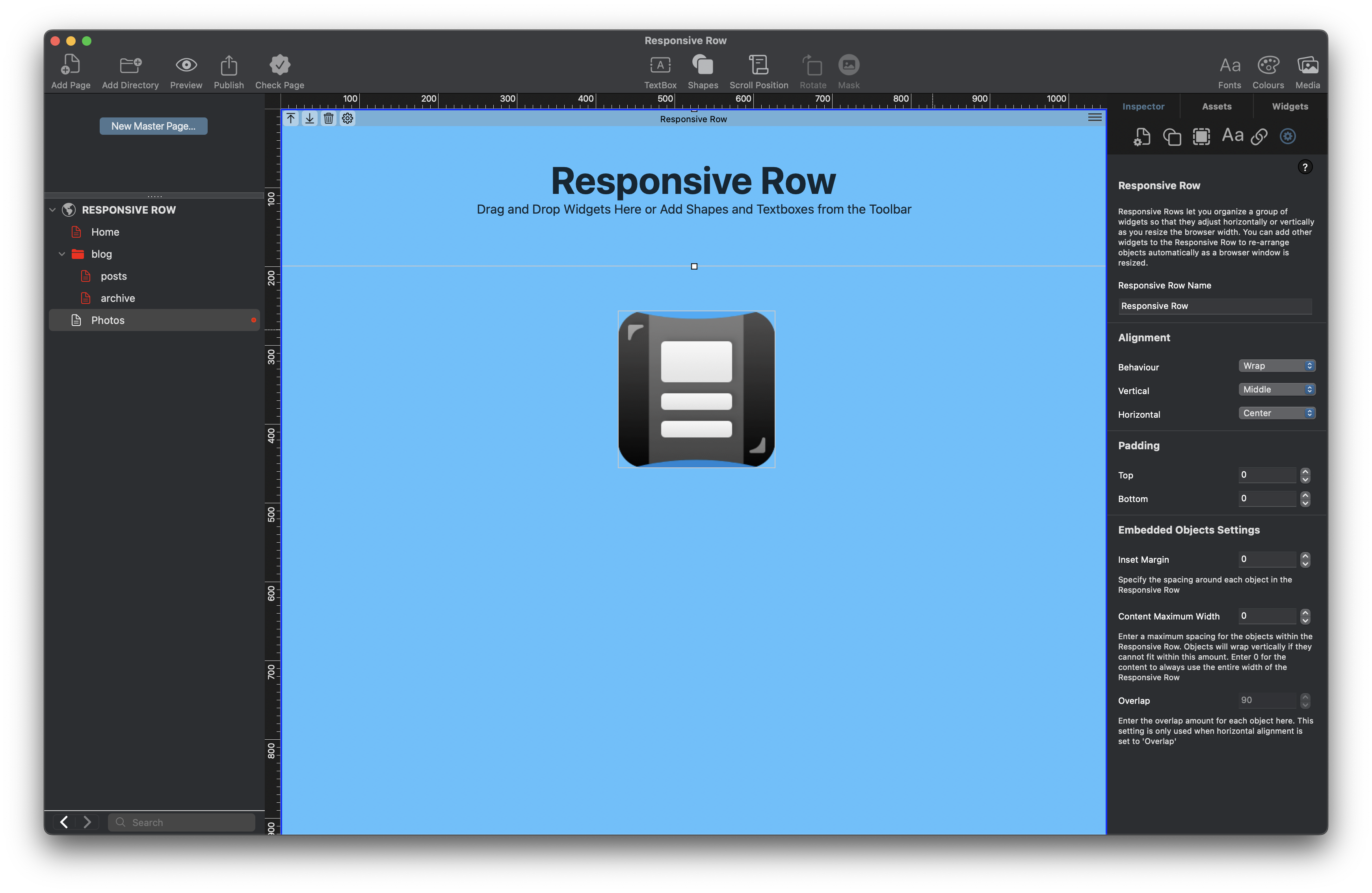
Attaching a Master page to all of the regular pages in your site is the other important task to complete here. Master pages should be used for objects that you would use consistently on all pages, e.g. company name, logo etc. You can even set up your page background color as well to make your life easier.
The added advantage of using Master pages is that if you need to update your company logo, for example, all you will need to do is update the logo on the Master page. This will save you time and effort and will guarantee a consistent looking site.
2. Make Site Navigation Easy
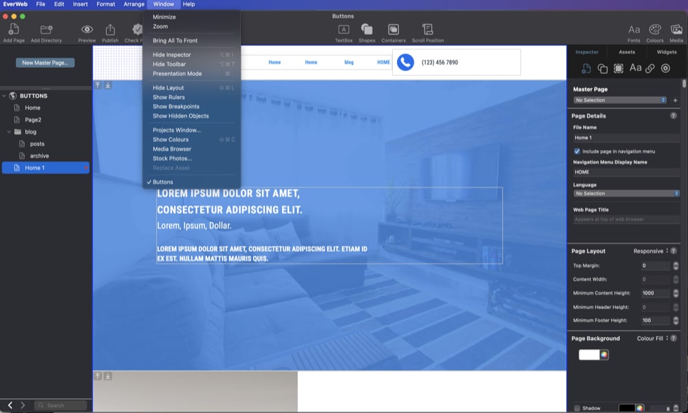
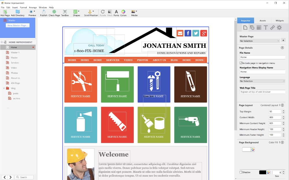
We all know what it is like when you find yourself trying to navigate a seemingly impossible to navigate site! It’s frustrating and can lead you to click away from the site if you know that there are other alternatives. So, when it comes to building your own site, keep things simple. Your menu structure should be simple and one level deep at most. Look out for the upcoming EverWeb 4.4 release which has a couple of cool new features to help make navigation easier than ever!
Make sure as well to keep the labels used in the navigation menu short and to the point. Remember as well, that each navigation menu item is a hyperlink so naming them properly may benefit your SEO as well as your visitors! Also, generally, use a hamburger menu icon for when your pages are being displayed on mobile devices.
When designing your navigation, keep the essentials there. Anything else (e.g. legal notices etc.) should be consigned to the footer area of the page.
If you have a large site with a large number of pages, you may also want to consider using a search function on your pages. Use EverWeb’s Search Field widget if you need this functionality.
3. Use Mobile Responsive Pages
As you are probably aware, most internet searching and browsing these days is done on some form of mobile device. For this reason, search engines like Google and Bing, prioritize content that is made for such devices. This typically means that as a website builder, you should ultimately gravitate towards building responsive websites rather than fixed width ones.
4. Create a Compelling Home Page
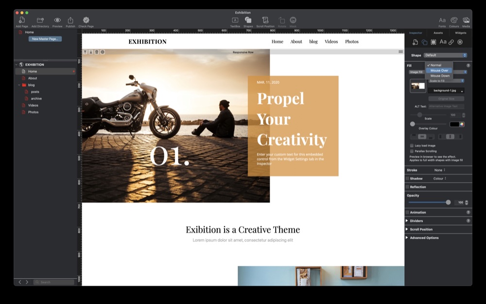
The Home, or landing page will typically be the first page that your visitors will reach when accessing your site, so you have to make sure that it will be engaging with a strong headline and an engaging image or video. Don’t forget to use an H1 tag on your page headline for your site’s SEO!
The Home page is also a great venue to tell your visitor about what your site is about, what goods and services you offer, maybe a little history of how and why you are here online,if relevant, plus a clear call-To-Action such as “Get Started,” “Shop Now,” “Contact Us” etc.
5. Use an About Page / Trust Signals
Your website should always be authentic. It is important to convey this so that your visitors know that your site is real, and not a fake. Some ‘personalisation’ may help in this respect, as well as making your site stand out from ‘generic’ websites. Using an ‘About’ page in your site is one way to achieve this.
Adding images of your physical site (and a map if appropriate), adding bios of staff or the founder(s) of the business may also be advantageous. If you can, get testimonials from your clients to add in, as well as showing off any awards that your business may have garnered. Some of these items you may also be able to add on the Home page (e.g. testimonials) so take care when choosing where to place this type of content.
An About page may also be a useful place to include necessary, or legally required, information to your site. Remember, though, that some information should be on all pages, e.g. copyright notices should be in the footer of every page in your site, and not just on the About page.
The goal of your About page should be to build, and maintain, credibility and trust with your visitors, for now and the future.
6. Contact Information
How many websites today either lack a way for their visitors to make contact, or make it very hard to do so? Adding an easy way for your visitors to make contact with you, using either a contact form, email, phone, or physical address (if appropriate) may give you the customer service edge that others don’t provide. EverWeb makes it easy to add social media buttons to your site. You also have the Google Maps widget or the Shape Fill Maps option, and the Contact Form Advanced widget with Contact Forms Enhanced addon if you need it to make sure you and your visitors keep in touch with each other. Alternatively, a blog with an enabled Comments section will allow more dynamic interaction through Disqus or Facebook Comments.
7. Add High-Quality Content
One of the key tenets of a good website is well written, quality content. Your visitors will appreciate this and will come back for more. This type of content is also good for your SEO, as Google and Bing also prefer quality over quantity.
Remember to write clearly and watch your grammar and spelling along the way. Use the tools that are available to check what you have written if in doubt. For search engines, you may want to use bullet points where appropriate as this will also help your SEO as well as making your content as faster read for your visitors.
In addition, you may want to consider writing a blog or include other media such as video and good images in your site. In all cases, though, keep your content up to date as much as possible. Websites that clearly have only old content usually turn visitors away…
8. Don’t Forget Legal & Technical Essentials
Sometimes you might need to add in items to your site because of local laws, or to help protect your own content. For example, adding a copyright symbol, current year and your company name (e.g. “© 2025, ABC Company”) in the footer of each page in your site is a must have to deter people from stealing your content.
Check out your local policy on Cookie notices, and terms of service, and include what you legally need to include in your site. As this is the Internet, you may have a global audience, not just a local one, so your site may have to cater for legal obligations in other countries as well as your own e.g. EU laws.
In addition to legal obligations, you should also secure your site that uses HTTPS and not HTTP. If you are an EverWeb+Hosting user, you can easily upgrade your site using our Site Shield Addon.
The last aspect of your site to check for is page loading speed and including SEO as required. Check out the links provided here for these.
Making sure you have the essentials down in your site will benefit you now and in the future as your site will remain focused. This in turns helps your visitors and hones your target audience. Coupled with a simple navigation, responsive design, consistent look and feel of your site and some SEO tweaks, and you’re up and running!

 Twitter
 Facebook
 Youtube
 Blog RSS