Celebrating EverWeb’s 11th Anniversary! The Best No Coding Website Builder for Mac and Windows!

Thursday, November 14th, 2024

Over the last 12 months, EverWeb has added numerous features to enhance your website building experience, boost your website’s performance, and make designing your site more flexible than ever! Our releases over the last year included EverWeb version 4.1 in January 2024, EverWeb version 4.2 in June and the maintenance release, version 4.2.1 in July. We are currently wrapping up the testing of the new EverWeb 4.3 for Mac and Windows release which should be available in the next few days. We’ve got some great new features coming in this release together with an all new widget!

We have also been working hard behind the scenes over the last twelve months, laying the foundations for some awesome new features that we will be showcasing in the next twelve months!

In the meantime, here’s a review of what happened in our 11th Anniversary Year!

Your Wish Lists Items Fulfilled!

Adding features to EverWeb that you want to see is always a priority. Your suggestions, via the EverWeb User Forum, are always welcomed and we are always super interested in hearing from you about what you would like to see in future versions of EverWeb. Over the past twelve months a lot of these ‘wish list’ features have been added! This includes the new Draft Page Mode, Lazy Loading Image files and the ability to drag and drop pages between different project files.

There are more wish list features that we are going to fulfil over the next twelve months, starting with the addition of Justified Text in TextBoxes in the upcoming EverWeb version 4.3.

Expanded and Enhanced Shape Options…

It has been a great time over the last two years for EverWeb’s Shape Options Fill options! Firstly, Fill Slideshow debuted as a new Fill option in EverWeb 3.6, followed by new Map Fill and Video Fill options that were introduced with EverWeb 4.2. These new options allow you to add slideshows, maps and videos to most object types and in the case of Map Fill, you have expanded mapping options that go further with Google Maps than EverWeb’s inbuilt Google Maps widget can!

More Video Options Come To EverWeb!

Adding more video related features to EverWeb has also been something that we have wanted to add for you for a while. EverWeb version 4.1 and 4.2 made this a reality with the aforementioned Video Fill on the Shape Options tab and also the arrival of video fill for the Browser Background. Again, we added lots of options for this feature so you can easily get the video background as you want it on your site!

User Interface and User Experience Improvements and Enhancements

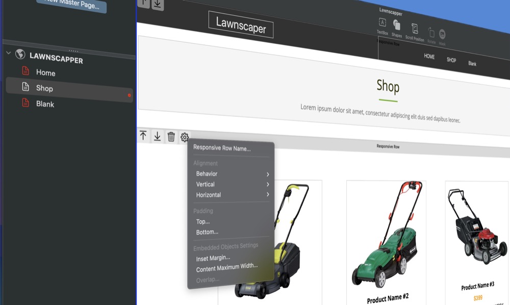
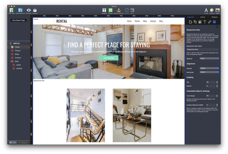
Since EverWeb’s 10th Anniversary, we also took time to make EverWeb easier by adding a settings cog to most objects so that you no longer need to mouse over to the Inspector Window. We also introduced a Toolbar for the Responsive Row widget, and enhanced many settings such as new alignment options for Page Background and Shape Option’s Image Fill feature.

In addition, the SEO Check Page addon was updated to include more SEO features, and WebP support also came to EverWeb to help make your pages load even faster in any browser that supports this feature.

All of our updates reflect our ongoing commitment to you to make designing your website easier and more professional. Please let us know your feedback and what you would like to see in future EverWeb updates! And don’t forget EverWeb 4.3 will be available soon!

Thank you as always for your continued support!

# Team EverWeb

EverWeb on Social Media

You can also find EverWeb on the following social media platforms:

Facebook

Flipboard

YouTube

X

Instagram

New Responsive Row Widget Options Come to EverWeb 4.2

Thursday, June 27th, 2024
EverWeb 4.2's New Responsive Row Toolbar features

One of the major goals of EverWeb is to always make building your website as simple and as easy as possible. With this in mind, our latest release, EverWeb 4.2, has added some great new ways of working with the Responsive Row widget that should save you both time and effort!

New UI Tools for The Responsive Row Widget

The Responsive Row widget has been updated to include a Toolbar that runs across the top of the widget. You will see the Responsive Row Toolbar whenever you select the widget. The name of the Responsive Row is now displayed in the middle of the Toolbar, whereas in previous versions of EverWeb it was displayed in the top left hand corner of the widget. There are five icons in the Responsive Row’s Toolbar:

  • Up Arrow – Click on the Up Arrow symbol to move the Responsive Row up the page.
  • Down Arrow – Click on the Down Arrow symbol to move the Responsive Row down the page.
  • Trash Can – This icon deletes all of the embedded objects that are currently in the selected Responsive Row, if there no objects embedded in the Responsive Row, then pressing the Trashcan icon will delete the Responsive Row itself. If you have deleted embedded objects, or the Responsive Row itself by mistake, use the Edit-> Undo (Command-X on Mac, Control+X on Windows) command tp restore the objects.
  • Settings Cog – Use this icon to access the Responsive Row’s widget settings without having to mouse over to the Widget Settings tab. This is a great way to help you work more efficiently.
  • Move Icon – Click and drag on this three line icon in the right hand side of the Responsive Row Toolbar then drag and drop the widget up or down to where you want it placed.

Additional Ways of Moving the Responsive Row Widget

The new Responsive Row Toolbar lets you move the currently selected widget up or down the page using the up/down arrows or by using the Move icon located on the right hand side of the Toolbar. In addition, you can also just click and hold the cursor on the any empty part of the Toolbar itself and drag it up and down the page as desired. Release the mouse when the widget is positioned where you want it on the page.

Hiding The Responsive Row Toolbar

If you do not want to see the Responsive Row’s Toolbar icons use the Window-> Hide Layout menu option. When you select this option the complete page layout will be hidden as well as all of the in-situ icons. Only the currently selected object will display the ‘in-situ’ icons. to restore the page layout features, just toggle the Window-> Show Layout menu option.

EverWeb 4.2’s new UI features help make designing and customizing objects and widgets, such as the Responsive Row widget, even easier and quicker than ever! We hope you enjoy this new feature and if you have any comments, please let us know below.

EverWeb on Social Media

You can also find EverWeb on the following social media platforms:

Facebook

Flipboard

YouTube

X

Instagram

Learning About Responsive Website Building Through EverWeb’s Theme Templates

Thursday, May 16th, 2024
Responsive Websites and EverWeb Theme Templates

Creating your first website is an exciting experience but it can also be a daunting one for the inexperienced. EverWeb makes designing and building your website as easy as possible, with drag and drop capabilities meaning that you do not have to code to be able to create the site that you want.

Website building is full of choices, and perhaps the most crucial one coming before you begin building your site’s first page. What type of website should you be building? This may seem a strange question if you are completely new to website building. In EverWeb, there are two types of website that you can build. We use the terms ‘fixed width’ and ‘responsive’ to describe these two types of websites.

A Fixed Width type website is a free form type of website where you can drag and drop objects such as images, text, shapes etc. anywhere on your work canvas. You can freely move objects around the page to wherever you want. It is a great way to start if you have never built a website before. The downside to this type of website is that because the pages are ‘fixed width’ you will have to design pages for desktop devices and corresponding pages for mobile devices. So you double your page count and will have to maintain two sets of pages.

The second type of website is ‘Responsive’. The difference between this type of website and a fixed width one is that a responsive site’s design is more structured, rather than free form. Responsive websites also automatically respond to the type of browser their pages are being displayed upon, so you only need one page design and not two. As a result, there should be less maintenance of your site’s pages to do in future, but the design process itself can be more challenging than if you were designing a fixed width site.

Learning Using EverWeb’s Theme Templates

Some EverWeb users start by building a fixed width website then later on redesign their website as a responsive one. This makes sense if you have no website building experience and also if you are new to EverWeb. It also means that you get your site up and running quickly and get more experience with EverWeb at the same time.

When it comes to creating a responsive website, you can use the skills that you have already acquired to create your responsive website. To get familiar with how a responsive website works, you could download one of the responsive theme templates that comes with EverWeb and look at how the theme template has been designed. For example, create a new project from the Projects Window in EverWeb then add the Home page of the Advisor template to the new project. When the page is added to the new project, click and drag the right hand side of the EverWeb app to the left and right. You will see the page change in the Editor Window as you do so. Objects move and change to conform automatically to the width of the page. Notice also that these objects are contained within bands across the page.

Let’s start with the band at the top of the page. This is named ‘Header’. Inside the ‘Header’ are two objects’: A TextBox that contains the word ‘Advisor’ and a Navigation Menu widget. The ‘band’ in which these objects are located within is a Responsive Row widget. As you narrow the width of the EverWeb app, you will notice that the Navigation Menu widget changes from a standard menu structure to a Hamburger menu. Double click on the Navigation Menu widget then scroll down its Widget Settings. You will notice in the Responsive Options section that ‘Responsive Navigation Bar’ has been checked and that it is set to ‘Appear at Width’ of 700 pixels or less.

Next let’s take a look at the third row of the page. This is a TextBox containing the page title (“I’m a Business Advisor” and some subheading text. Note here that the text goes right across the width of the page. When you reduce the width of the page, the text automatically repositions itself so that it always fits the width of the page. Click on this TextBox, then go to the Metrics Inspector. You will see that the ‘Full Width’ box has been checked.

Next let’s move on to the fourth row of the page. In this row you will see a TextBox with ‘Contact Me’ as its text, together with a hyperlink embedded within a Responsive Row widget. Compare this to the full width TextBox above it. In the ‘Contact Me’ row, we do not want the TextBox to be full width. Click on the TextBox then click on the Metrics Inspector. You will see that the TextBox is just 157 pixels wide. This is wide enough to be displayed properly in any browser window on any device. This also gives us our first example of a fixed width object on a responsive page. When designing your own pages, be careful if you have fixed width objects within a Responsive Row widget. The width of the fixed width object should not be too large that it causes the page to scroll to the left and right. As a guide, make fixed width objects only have a maximum width of about 350-400 pixels.

The next row of interest is the Responsive Row containing the image. Click on the image to select it then go to the Shape Options tab. Here you can see that the image has been set up as Scale to Fill. When adding images to your own responsive page, you may need to experiment to see which type of image fill is best to use, as the best option to choose usually depends on the image itself.

Next click on the Metrics Inspector. You will notice that the image is set as a full width object. Also note, though, that the maximum width of the image has been set to 900 pixels wide. In this way, the image will not become too large if you increase the width of the page.

The other interesting point to note about this Responsive Row is that its background colors are blue and white. To see how this has been created, click on the blue-white area to select the Responsive Row itself, then go to the Shape Options tab again. You will see now that the fill is an Advanced Gradient Fill with blue occupying one side of the fill and white on the other.

Under the image, is another Responsive Row widget, this time containing a TextBox on the left hand side, with two Text Section widgets to the right of the TextBox. The TextBox has a width of 375 pixels and each Text Section widget a width of 280 pixels. In this row, the Text Section widget combines text and an image to create an effective display. Note also how all three objects change as you change the width of the page.

The final row we are going to look at is the one directly below the Life Coach Training full width TextBox. This row is in fact a FlexBox widget that contains three Embedded objects. FlexBoxes, like Text Section widgets are very useful tools to use in Responsive page design! Take a look at the FlexBox’s Widget Settings. Note that each text/image embedded object combination has a maximum width of 335 pixels. Again, this means that the object will not be too wide for a mobile phone’s browser which typically is about 400-450 pixels wide.

Conclusion

Using a Theme Template is a great practical way to see how a responsive page has been created. If you create a test website as we did above, you can create safe environment where you can try out using a responsive theme template without any risks. This also give you the freedom to experiment to see what works and what does not work and to get familiar with designing responsive pages before tackling your own website.

Don’t forget to also check out the EverWeb User Manual and our videos on YouTube. If you have a question, you are always welcome to ask us here on this blog, or on the EverWeb User Forum.

EverWeb on Social Media

You can also find EverWeb on the following social media platforms:

Facebook

Flipboard

YouTube

X

Instagram

EverWeb’s Responsive Web Design Primer

Friday, June 9th, 2023

For the last few years, responsive web design has been the must have feature for website designers and EverWeb introduced this feature back in version 2.8. The goal of responsive web design is that you only have one page design which automatically adapts, or responds, to whatever device the page is displayed upon. Since its inception, responsive web design has become the standard for designing websites, but this does not mean that it is suitable for everyone’s needs…

Challenge, Complexity and Simplicity

Responsive Web Design successfully solves the challenge of the ‘one page fits all’ design challenge, but does so at a cost. The most cited cost is that it is more complex conceptually and also in implementation. It is certainly a different design paradigm that can lead to a frustrating design experience. Over the years, however, software developers have improved the tools that they create to help website designers build responsive websites. For EverWeb, the goal was to find a way to implement responsive web design in a way that you could still use EverWeb in the same way as you would building a center aligned page. The result is what you see in EverWeb today – the same experience whatever page design you choose to use.

If you have been an EverWeb user for a while, you may also have noticed that the tools used for creating Responsive pages in EverWeb have also evolved over time. Widgets have gained new and enhanced features to help making designing responsive pages easier, and other features have gained responsive capabilities. This is a continuously evolving and exciting process.

One of EverWeb’s own goals is to make designing the site that you want as easy as possible. So with that in mind, here are some tips to get you more comfortable about designing your first responsive website!

Rethinking Page Width

When you choose a theme template with a responsive page layout, you will notice that the ‘Content Width’ setting in the Page Layout Section of the Page Settings tab is greyed out. This is because a responsive page always takes up 100% of the width of the device it is being displayed upon.

There may be times, however, where you will want to limit to how wide an object can be on your page. You can use the Maximum Width setting in the Metrics Inspector to limit how wide an object can be.

You will probably also want to set a left and right margin on your page, which you can easily do, again using the Metrics Inspector’s Left and Right Margin settings in the ‘Size’ section.

Why There Is No Header on the Page

You may also have noticed that there is no Header section on the page and that the ‘Minimum Header Height’ section in the Page Layout section of the Page Settings tab is also greyed out. In responsive pages the header is just another full width object on the page, just placed at the top of the page, so it does not need to be treated in any special way.

Getting to Know Full Width and Fixed Objects

If you are new to Responsive website design, you may get thrown straight away when you add your first object to the page. For example, if you add a TextBox to the page, you will find that it takes up the full width of the page, which may, or may not, be what you wanted… A full width TextBox is probably great for a title, heading, or subheading on your page. Just add left and right margins from the Metrics Inspector and style your title text and you are finished! The same technique can then be applied to the body text of your page as well.

There might be instances where this may not be the solution you want, especially if you want to combine text with images, shapes, buttons and other media or objects. In this case, you should experiment with using widgets that easily let you combine such objects e.g. the Responsive Row, Text Section or FlexBox widgets.

Horizontal, Vertical and Freeform Perspectives

One thing that is very obvious with responsive websites is that all content is laid out horizontally in rows. Even if you see content displayed vertically in a column, this type of content will actually be structured within a row. Responsive website design is a structured approach which is needed so that the objects on your page can scale, and fit, properly at any page width.

If you are used to a more freeform approach in web design that is offered by EverWeb’s Center Aligned page layout, you may find responsive design restrictive. In reality, responsive web design is just structured as opposed to freeform. You can build a responsive website with a lot of flexibility and flair, it is only the design approach that is different, Designing successful responsive websites usually requires rethinking the way in which you design your site as well as using EverWeb’s responsive widgets which will help you creatively.

Keeping Everything In The Box

One of the keys to working successfully with responsive design is to remember that everything needs to fit inside ‘the box’ at all times. The box is the web page your are viewing. It is a flexible box so that you can easily change its height and width, which is exactly what you do when resizing your browser window.

Each row in your page is also a box which takes up the whole width of the page. As you change the browser with, each row will dynamically resize itself to suit the new outer box size. These rows can contain content (such as text, shapes or images), or may also contain boxes within themselves, for example, the FlexBox widget or Responsive Row. These boxes will, again, typically hold content.

So Responsive Web Design is analogous to working with flexible boxes within boxes within boxes. The main problem with this comes when page designs create boxes which are too large for the box they are wrapped in. If you create such a design then your page may at times, be too wide for the device it is being displayed upon. If you find yourself in this situation, check out our Solving Horizontal Page Drift video which explains how to easily fix the problem.

Conclusion

Working in a responsive web design environment may mean that you have to ‘think different’ and is a learning process too. It may not suit everyone’s needs but it is the best way to create a scalable site easily.

If you have a question about building a responsive website in EverWeb please let us know in the Comments Section below. We would love to hear about your experiences!

EverWeb on Social Media

You can also find EverWeb on the following social media platforms:

Facebook

Flipboard

YouTube

X

Instagram

Responsive Row Revamped in EverWeb 3.7!

Thursday, May 26th, 2022

If you are designing a responsive website in EverWeb, you are most likely to have used the Responsive Row widget at some time in your page design. This venerable widget debuted in EverWeb 2.8 when we launched responsive website design capability. The Responsive Row widget came along with the FlexBox, Text Section and Responsive Image Gallery widgets providing core functionality to EverWeb’s responsive page design feature.

The Responsive Row widget is a unique in that it is the only widget that you can contain another widget and this is also its main purpose. When designing a responsive website, there may be times where you might want to use a fixed width widget, for example, the PayPal or FaceBook Like widget. The fixed width nature of these widgets means, however, that they cannot be used on their own and so need to be placed within a container – the Responsive Row widget.

This is not to say though that the Responsive Row widget is limited to use with fixed width widgets. You can add any widget in to it e.g. you might want to group FlexBox, or Text Section, widgets together in a row. Furthermore, the widget is great for full width background images, spacing objects and for padding when using widgets that do not have their own top and bottom margins options. You can even create slide shows too using the recently introduced Fill Slideshow option.

Remember, though, that there are also plenty of times where using a Responsive Row widget can be complete overkill. Check out our blog ‘Responsive Row: To Use or Not To Use’ to find out how to work smart with the widget!

Responsive Row Gets Visual!

One of the goals for EverWeb 3.7 was to make the Responsive Row widget easier to use so that you could better see the objects that you were moving around within a Responsive Row or if you were moving objects from one Responsive Row to another.

With this in mind, EverWeb 3.7 now displays the object you are moving as you move it. If you select more than one object in the Responsive Row to move to a different location within the Responsive Row, you will now see that the selected objects are visually stacked as you move them ‘en-masse’. This makes dragging and dropping objects much easier and intuitive to do than previously. The same principle applies if you are moving on or more objects between one Responsive Row and another.

Secondary Clicking Options

The second goal improving the Responsive Row widget in EverWeb 3.7 was to make it easier to remove objects from a Responsive Row. As you ma know already, you can right click on objects in a Responsive Row widget to select, and move, them to other Responsive Row widgets. In EverWeb 3.7 you can now detach an object from a Responsive Row by secondary (right) clicking on the object you want to remove from the Repsonsive Row, then selecting the ‘Remove from Responsive Row’ option. The object will now be ‘detached’ from the Responsive Row and will become a free floating object.

More Help and Tips!

The final goal third goal for the Responsive Row, and EverWeb in general, with version 3.7 was to improve context sensitive help. You may also have noticed that generally in EverWeb 3.7 there are more context sensitive help dialog boxes. Most of these dialog boxes can be checkboxed so that you do not see them again if you don’t want them visible again. If you change your mind later on, you can reverse this by going to the EverWeb-> Preferences-> General menu option and click on the “Reset ‘Don’t Show Again’ Dialogs” button which is also new EverWeb 3.7 feature.

The wider use of context sensitive messages in EverWeb 3.7 also extends to the Responsive Row widget! We also added a new message box for when you add a Responsive page to your site. You now see a brief description of what a responsive site it and that you can use the Responsive Row widget within your responsive page design if you need to.

We hope that the changes to the Responsive Row widget and the addition of more context sensitive help makes working on responsive pages even easier than before. Let us know what you think in the Comments Section below!

EverWeb on Social Media

You can also find EverWeb on the following social media platforms:

Facebook

Flipboard

YouTube

X

Instagram

Using Text in EverWeb’s Responsive Pages: Part Two

Thursday, April 14th, 2022

In the first part of this blog post, we looked at the various ways in which you can add text to a responsive page in EverWeb and the effect of doing so on the page on different devices.

In this second part we look at how you create scaleable text in your web pages.

Creating Scalable Text in a Responsive Page Layout

If you want your text to scale according to the device that it is displayed upon, you will need to use EverWeb’s ‘Show on Device’ feature which you can find in the ‘Responsive section’ of the Metrics Inspector. Usually this section will be greyed out unless you click on an object in a Responsive Row, then the settings will become active. There are four options: Show on Mobile, Tablet, Desktop and Wide Desktop. By default all of these options are ticked.

We can use these options to create scaleable text. For each device type, we can create a TextBox that specifically suits that device. So for a mobile device you may want smaller text, slightly larger text for a Tablet, your ‘standard’ size text for a desktop and maybe a little larger text for wide desktops.

  1. First of all, add a Responsive page to your site or select a responsive page that already exists in your site.
  2. Next drag and drop a Responsive Row widget from the Widgets tab on to your page, or select a Responsive Row that already exists in the page, that you want to add scaleable text to.
  3. Make sure that the Responsive Row widget is selected.
  4. Now add a TextBox to the page using the TextBox button in the Toolbar. As the Responsive Row widget was already selected, the TextBox should be created as an object within the Responsive Row. The TextBox will appear as a fixed width object so will appear as a square TextBox within the Responsive Row. If you want to check, go to the Metrics Inspector where you will see the ‘Full Width’ box is not checked.
  5. If you have accidentally added a TextBox outside of the Responsive Row widget, it will appear as a full width object on the page. You can add this object back in to the Responsive Row by secondary (right) clicking on it, then selecting the ‘Embed In’ option. Choose the Responsive Row that you want. Note that the TextBox will still be full width, so to make it fixed width, go to the Metrics Inspector tab and uncheck the Full Width checkbox, then resize the TextBox to the size you want within the Responsive Row if you need to.
  6. Once you have added the TextBox in to the Responsive Row, add the text that you want to it. Style the text as you desire using the Fonts Panel which you can access from the Toolbar or by using the Cmd+T shortcut key.
  7. When setting the text size, set the size as you would if the text were to be displayed on a desktop device. This will give you a ‘baseline’ text size e.g. 18 point.
  8. Now that you havre established a baseline font size, it is also a good time to think about text sizes on other device types. You may want use the same text size on a tablet device. On a wide desktop, though, you may want a larger text size e.g. 20 point and on a mobile device you may want a smaller text size e.g. 14-16 point. You may also want to consider how to size text that’s used for page and section titles at this stage. Make sure that your text sizing scheme is consistent across all the pages you are using scaleable text on.
  9. Consider also the text itself that you have added to the TextBox. Do you want all of the text displayed on a mobile device or will you want to have less ‘detail’ and more ‘headline’ text only? Also for a wide desktop, maybe you have some additional text that you would like to add but did not have the space for on a desktop device. Again, we will come back to this soon.
  10. Now that you have your ‘baseline’ TextBox, make sure it is selected then use Cmd+D to duplicate it three times. You now have four TextBoxes, one for each device type.
  11. Set the Text font size for each TextBox and also remove or add text to the TextBoxes as appropriate for each device. For example, you could choose the TextBox on the far left of the Responsive Row to be the one for your mobile device. In this case, I might want to cut the amount of text down and set the font size for the TextBox title to be 18 point with the body text set to 14 point. The next TextBox to the right would then be for tablets, having e.g. title font size of 20 and body text size at 16 point with my ‘default’ amount of text. Continue the same way for the Desktop and Wide Desktop TextBoxes.
  12. Finally, select the TextBox you want to use for Wide Desktop. In the Metrics Inspector, go to the Responsive section and uncheck Desktop, Tablet and Mobile. Next select Desktop and uncheck Wide Desktop, Tablet and Mobile. For the Tablet TextBox uncheck Mobile, Desktop and Wide Desktop and finally for the Mobile TextBox uncheck Tablet, Desktop and Wide Desktop. You should see one TextBox on screen.
  13. Now either resize the EverWeb app, or Preview and resize the browser to see the text scaling up and down as you in increase and decrease the width of the browser or app window.
  14. For more information, check out our video on Show on Device.

Working with Text and Images

In the third part of this post, we will look at how you can work creatively with Text and other objects, such as images in a responsive page.

If you have any questions about this post, or about EverWeb in general, please let us know in the Comments Section below!

EverWeb on Social Media

You can also find EverWeb on the following social media platforms:

Facebook

Flipboard

YouTube

X

Instagram

Using Text in EverWeb’s Responsive Pages: Part One

Wednesday, March 30th, 2022

Adding text in to a Responsive page design in EverWeb can be done in a number of different ways and also raises some interesting questions along the way. In this post, we’re going to look at some common scenarios and questions that we get on the forums and through our support team about text in a responsive page…

Adding Text to a Responsive Page

You can add text to a responsive page in a number of different ways:

  1. Adding a TextBox to the page
  2. Adding a TextBox within a Responsive Row widget
  3. Adding text within the Styled Text Editor of the FlexBox, Text Section or PayPal widget
  4. Adding text in to a widget that uses the Styled Text Editor inside a Responsive Row widget
  5. Adding text in to the Blog Post Editor

Some of the most common questions regarding the use of text are:

  1. How can I get my text to wrap?
  2. How can I get text to wrap with other objects?
  3. How can you change text size as you resize the browser window or when using vastly different device sizes?

TextBoxes and Text Wrap

Let’s start by looking at the simplest example: Adding a TextBox to a responsive page. When you add a TextBox, it will, by default, be created as a full width object, taking up the width of the page. Now, you could add a few paragraphs of text in to the TextBox so that you can see the effect of resizing the page on the TextBox. You can resize the page by grabbing a side or corner of the EverWeb app and making it larger or smaller. You will see the text in the TextBox wrap according to the width of the page. If you want, go to the Metrics Inspector tab and add a Left and Right Margin to the TextBox so that it will look better on the page when previewed or published. You can also force a limit to the width of the page by using the ‘Maximum Width’ field. This is useful when you do not want the text in the TextBox to be too spread out across the page. Usually you can leave this value at 0 and use the Left and Right Margin values, but it is worth experimenting with Maximum Width values of e.g. 600, 800 or 1000 to see the effect on the text in the TextBox.

TextBoxes, Responsive Rows and Text Wrap

The above example is the simplest scenario, so let’s now move on to what happens if you add a TextBox in to a Responsive Row widget. Start by adding a Responsive Row widget to the page from the Widgets tab, then click on the TextBox button in the Toolbar to add a TextBox in to the Responsive Row widget. Again, enter a few paragraphs of text in to the TextBox.

In this scenario, the TextBox is treated as a fixed width object within the Responsive Row widget. You can see this by going to the Metrics Inspector where you will see that the ‘Full Width’ checkbox is unchecked. You can also change the height and width of the TextBox as well. Try changing the width if the TextBox to 800, then resize the EverWeb app by grabbing one side, or corner, of the app and making it larger or smaller. You should see that the Full Width TextBox created in the first example wraps, but the TextBox in the Responsive Row does not wrap.

The reason that this happens is that the TextBox in the Responsive Row is a fixed width, so is ‘static’. We can, however change this if we want the text to wrap. Start by making sure the TextBox in the Responsive Row is selected. Next, go to the Metrics Inspector and check the ‘Full Width’ checkbox. The text will now take up the full width of the page. Set a Left and Right margin for the TextBox. Once you have done this, put a value in the ‘Maximum Width’ field e.g. 800. You will see the text reformat when you take these actions. Now resize the page again and this time, you will see the text wrap within the Responsive Row.

This is great way in which you can combine wrapping text with other objects in a Responsive Row widget.

The Styled Text Editor and Text Wrap

EverWeb’s Styled Text Editor appears in three of its built in widgets: The FlexBox, Text Section and PayPal widgets. The first two widgets can be used as full width objects or as fixed width objects within a Responsive Row widget. The PayPal Widget, though, always has to be placed as a fixed width object within a Responsive Row widget.

When using the FlexBox and Text Section widgets, you can customize how text wraps as you have maximum width fields available in both widgets. For the FlexBox widget you have even more control as each embedded object can have a maximum width value as well. For the PayPal Widget, you do not have these options so text will be fixed width only, so will not wrap.

So far we have looked at how to get text wrap in the most simple way with a single TextBox and how to integrate text wrapping in to text that you use within a Responsive Row widget.

In Part Two of this post, we will look at how you can create scaleable text in your web pages and how to integrate other objects such as images in to text.

If you have any questions about this post, please let us know in the Comments Section!

EverWeb on Social Media

You can also find EverWeb on the following social media platforms:

Facebook

Flipboard

YouTube

X

Instagram

What’s New in EverWeb 3.5.1?

Tuesday, September 28th, 2021

We are happy to announce the immediate availability of EverWeb version 3.5.1. This is a maintenance and stability release for the recently released EverWeb 3.5 which introduced Website Search to EverWeb. In addition to the usual fixes, the new version of EverWeb includes some additional new and enhanced features detailed below and in our E erWeb 3.5.1 release video.

Please let us know in the Comments Section below if you have any questions.

EverWeb 3.5.1 Includes…

  • NEW For widgets that have an Assets List, you can now select multiple rows and the adjust settings for all of the selected Assets rather than having to go through each Asset individually to adjust its settings.
  • NEW: Quick Look works for Assets Lists in widgets.
  • NEW: You can now secondary (right) click on an object in a Responsive Row widget and remove it from the Responsive Row.
  • NEW: Double clicking an object that is from a Master Page will show a warning that you have to edit it from the Master Page.
  • NEW: If a crash report cannot be sent because EverWeb has to Force Quit, the next time EverWeb is launched you will see the crash report.
  • NEW: The FlexBox widget now includes Button border styles.
  • NEW: The FlexBox widget now includes a ‘max width’ property option for the button.
  • NEW: The FlexBox widget now includes a transparency option for the mouse hover color.
  • NEW: You can now paste a list of keywords separated by a comma in one row of the Keywords list in the SEO Section of the Page Settings tab and in the Keywords section of a Blog Post. EverWeb will automatically parse the list into individual rows.
  • NEW: Added the video for the Search Bar to the Help ‘?” in the Site Search section of the Page Settings tab.
  • NEW: TheSearch video has been added to Site Search widget.
  • NEW: Site Search now uses Page Names if there is no title in the Web Page Description field in the Page Settings tab.
  • NEW: Site Publishing Settings has a new ‘Add Domain’ button to easily register a new domain or to add a domain as an add-on.
  • NEW: New Font Size variable for widgets.
  • NEW: When using Disqus as the Comment Engine in Blog Posts, if you change a blog post title, you can now have Disqus use the new post title in place of the old title.
  • IMPROVED: Copy and pasting text in to the Blog Post Editor.
  • IMPROVED: The FTP Timeout window now shows the error along with the automatic reconnection/republish feature.
  • IMPROVED: Changing the Navigation Menu Display Name for a page not in the Navigation Menu widget will not mark the pages with a Navigation Menu widget to be re-published.
  • IMPROVED: Some settings in a widget’s Assets List that do not affect the EverWeb UI will not cause the widget to update itself.
  • IMPROVED: Better error checking when an image cannot be published.
  • IMPROVED: Removed the ‘Show Title’ checkbox in the YouTube widget as the setting is no longer valid.
  • IMPROVED: Better error checking enhanced popup menu.
  • IMPROVED: Error checking when replacing an image asset with a non-image file.
  • IMPROVED: Responsive Rows with just one object in them cannot be moved around and dragged out of the Responsive Row.
  • IMPROVED: Improved language localizations, especially Dutch.
  • FIXED: Fix for shapes with ‘No Fill’ and a border not being published properly.
  • FIXED: Spelling corrections in the Search Results widget.
  • FIXED: Fixed blog updating issues on macOS 10.16.
  • FIXED: Fixed blog cover image not appearing on macOS 10.16.
  • FIXED: When using Quick View to Preview an asset in the Assets List, the down arrow now works correctly by previewing the next asset in the Assets List.
  • FIXED: Better error checking/messaging when trying to preview a site without any pages.
  • FIXED: Some buttons did not properly auto resize when using different languages if the text in that language did not fit the button.
  • FIXED: Fixes to how EverWeb gets the preview for certain widgets within the Editor Window.
  • FIXED: Min value for widget text fields could be set to a negative value.
  • FIXED: Fixes for the Image Gallery widget when pressing the Pagination Buttons within the Editor Window.
  • FIXED: File links work again in widgets using the Styled Text Editor.
  • FIXED: Insert Date features works for non English systems.
  • FIXED: Spelling mistake in Search Results widget Inspector fixed.
  • FIXED: Fixed potential crash when using very large images with the scaling features for object backgrounds.
  • FIXED: Fixed widget previews when replacing an image asset that the Widget is using.
  • FIXED: Replacing an image asset with a different file extension will adjust the file extension in the Assets List.
  • FIXED: Fix for FTP publishing for servers that require TLS for data and control connections.
  • FIX: Widgets will properly preview when adjusting settings quickly, such as background color using the color window sliders.
  • FIX: Widgets will now respect default hyperlink styles set under the Default Styles Window.
  • FIXED: Fixes to full width shapes placed in Responsive Rows.
  • FIXED: Fixed some labels in message boxes that were cut off.
  • FIXED: Filenames that used non-English characters are no longer converted into their English equivalent.

EverWeb on Social Media

You can also find EverWeb on the following social media platforms:

Facebook

Flipboard

YouTube

X

Instagram

EverWeb 3.5: Apple Silicon Ready, Website Search, Blog Post Summaries and More!

Saturday, July 10th, 2021

We’re excited to introduce EverWeb 3.5 which is all about Website Search! Two great new widgets give you fully customizable website search options and three ways of displaying the search results. That’s not all though as we have added reverse wrap to the Responsive Row widget, Short Summaries and keywords to blog posts for better SEO and Open Graph tags have been added to the SEO PowerUp addon for better social media interaction.

Last, but not least, EverWeb 3.5 has been developed as a macOS Universal Binary, so will run natively on Apple Silicon Macs without the need to use Rosetta 2 as well as running on Intel Macs as always!

All this and more in EverWeb 3.5! Check out EverWeb’s new features in the video at the top of the page and below for a complete list of its new and enhanced features as well as the usual fix list.

Which Version of EverWeb is For You?

EverWeb is available in the following versions:

  • If you are running an Intel Mac running OS X 10.10, macOS Yosemite, El Capitan, Sierra, High Sierra, Mojave, Catalina or Big Sur, EverWeb version 3.5 is available for you.
  • If you are running an Apple Silicon Mac running macOS Big Sur, EverWeb version 3.5 is available for you as a Universal Binary. EverWeb will run natively without the need to use Rosetta 2.
  • If you are running OS X 10.7 – 10.9 (Lion, Mountain Lion, Mavericks) EverWeb version 3.1 is available for you.
  • If you are running OS X 10.6 EverWeb version 2.5.2 is available for you.

When updating to the latest version of EverWeb, the update process will automatically download the correct version of EverWeb for your operating system.

EverWeb 3.5 Includes…

  • [NEW] EverWeb 3.5 can be run on Apple Silicon Macs as a Universal Binary using macOS 11 Big Sur.
  • [NEW] Search Website feature allows your visitors to search your website’s pages.
  • [NEW] Website search results can be displayed in a dropdown list, a popup window or on a dedicated page.
  • [NEW] Search Field widget allows you to set up a search bar and search results.
  • [NEW] Search Results widget allows you to display results in one of the pages in your website.
  • [NEW] Site Search section in the Page Settings tab of the Inspector window allows you to include or exclude the page in website searches.
  • [NEW] The Responsive Row widget now includes a Reverse Wrap option.
  • [NEW] You can now duplicate Form Controls in the Contact Form Advanced widget.
  • [NEW] YouTube widget now includes a mute sound option.
  • [NEW] Open Graph Tags are automatically included when you publish your site.
  • [NEW] Short Summaries for blog posts allow you to enter descriptive summaries about your posts.
  • [NEW] You can enter Keywords in your blog posts.
  • [NEW] The Blog Post Editor Toolbar now includes options for ordered lists to be either Default, Lower Alpha, Lower Greek, Lower Roman, Upper Alpha or Upper Roman.
  • [NEW] You can add Hex codes for colors in the Blog Post Editor Toolbar’s Color Picker.
  • [NEW] The Blog Post Editor Toolbar now includes options for unordered lists to be either Default, Circle, Disc or Square.
  • [NEW] A ‘Duplicate’ button has been added to the Contact Form Advanced widget’s Form Controls section.
  • [NEW] A ‘Test SMTP Details’ button has been added to the Contact Form Advanced widget.
  • [NEW] Option to only use local Jquery and not try to connect to Google servers has been added to Site Publishing Settings.
  • [IMPROVED] If you add or remove pages that are included in Navigation Menu widget only the pages with the Navigation Menu widget will have to be republished.
  • [IMPROVED] Improvements to loading HTML previews in HTML viewers for widgets that use plugins.
  • [IMPROVED] RSS Feed widget improvements for when images can’t be found in a feed. The widget will still properly preview.
  • [IMPROVED] Improved language localizations.
  • [FIX] Fixed an issue with shapes that use picture frames not exporting properly.
  • [FIX] Arrange-> Align-> Left and Arrange-> Align-> Bottom now work correctly.
  • [FIX] Shapes using Picture Frames could not have a colored background but now can.
  • [FIX] In the Assets List, secondary clicking on multiple assets and selecting ‘Add to Folder…’ would incorrectly add an external file to the images section of the Assets List if an external file was selected while some image files were also selected.
  • [FIX] Select color button now copies colors properly with the right click->Copy function.
  • [FIX] Assets that are used in blog posts can now be found properly.
  • [FIX] Render error icon for widgets when they cannot be generated due to compilation errors.
  • [FIX] Fix for exception on mouseover in Navigation Menu widget.
  • [FIX] Shadows now work for widgets and when exporting responsive css.

How To Update To EverWeb 3.5

You can easily update EverWeb by either:

  1. Launching EverWeb then going to the EverWeb menu at the top of the screen and selecting ‘Check for Update’ or by
  2. Downloading EverWeb from the EverWeb website.

After downloading EverWeb, double click on the EVERWEB.DMG file. A window will open. Drag the EverWeb icon on to the Applications folder icon. Once the file has been copied, you can close the installation window, delete the .DMG file and eject the EverWeb disk on the desktop by dragging it to the Trashcan.

Remember, you won’t lose any previous data when updating as your website project files are stored elsewhere on your computer.

The update is free for EverWeb + Hosting users and EverWeb Standalone users who are within their 1 year of free upgrades and support period.

You can easily check your EverWeb Standalone free update period from EverWeb’s Preferences window or from your client area.

If you have passed your one year of free EverWeb updates, you can purchase 1 more year of upgrades and support from your client area.

You can easily re-download earlier versions of EverWeb from your client area if you are not ready to purchase an additional year of updates and support.

Login to your client area and go to the ‘Manage Product’ page. On the left of this page, select ‘Downloads’ and choose the version of EverWeb that you need.

More Information About EverWeb

For more information about the new version of EverWeb, please check out the following resources:

  • The EverWeb website which has up to the moment information in it’s new blogging section
  • New EverWeb videos on YouTube
  • The EverWeb User Manual in EverWeb’s Help-> User Manual menu
  • The EverWeb Discussion Forum

If you can’t find what you need, or have any other questions, comments or feedback please let us know. We’re happy to help.

EverWeb on Social Media

You can also find EverWeb on the following social media platforms:

Facebook

Flipboard

YouTube

Twitter

Instagram

7 Design Tips for Better Responsive Pages in EverWeb!

Friday, September 18th, 2020

Responsive Web Design is the website paradigm of today. Creating websites using scaleable pages was for a long time the holy grail of website design. And with good reason too, as if done correctly, pages created in this way look and work fantastically on all devices that they are displayed upon.

The problem with this concept though, are the words ‘if done correctly‘. Responsive Web Design is, in itself, a more complex design paradigm to get your head around than fixed width page designs. There’s also the matter of design freedom Many website designers prefer using fixed width page layouts, such as the centered page layout in EverWeb, as such layouts allow text, images and other media to be placed freely on the page. Responsive Website Design is often seen as more restrictive in this respect.

There are many pros and cons in both responsive and fixed width design strategies and there is no definitive answer as to which approach is better. However, it is usually best to build your website in the way that suits your website’s goals and requirements. From this starting point, the choice over which page layout style to use should be easier.

What is certain, though, is that Responsive Website Design is here to stay. If you have EverWeb 2.8 or higher, the responsive page layout is built in to the product.

For a full deep dive in to Responsive Web Design in EverWeb, check out our YouTube videos and the EverWeb User Manual which includes a dedicated chapter on Responsive Web Design. In addition to these resources, here are some EverWeb responsive page design tips to help you along the way.

  1. Update EverWeb to the latest version. Since the introduction of the responsive page layout in EverWeb 2.8, there have been many additions and enhancements to the tools that you can use to create responsive web pages. For example, the Metrics Inspector has added maximum content width, show on device and breakpoints. There is also responsive ‘Set shape as scroll position‘ which enables robust object hyperlinking in a responsive environment. The Shape Options tab has added full width background fill capabilities for full width widgets. The Responsive Row, FlexBox, Text Section and Responsive Image Gallery widgets have all been upgraded and most other widgets have gained full width capability.
  2. The FlexBox Widget Is Your Go To Solution! Designing a website means making lots of choices. In responsive page layouts, the FlexBox widget will probably be your widget of choice to make your page design the best it can be. When combining objects together, such as text and images or images, video and text, or when you need to add a button in to the mix, the FlexBox widget has the most options and flexibility. The widget can even be a great solution when you are using only type of object on your page. If you cannot decide which widget is best to use to solve your design issues, try the FlexBox widget first!
  3. Responsive Row Widget Overuse. Often the Responsive Row widget is used for everything even when it is not needed. Whilst the widget is a ‘jack of all trades’, using it when you do not need to complicates your design and adds unnecessary code to your page. Check out our ‘Responsive Row: To Use or Not To Use‘ blog for more hints and tips on when, and when not, to use the Responsive Row widget.
  4. Check Out Show on Device! Even though Responsive Web Design is the one page solution for all device types, you may find that sometimes you need a particular design solution for one, or more, device types. This is especially so when viewing pages on mobile devices where horizontal space is limited and you do not want a page height that has your visitor scrolling seemingly forever. EverWeb’s Show on Device feature lets you control when you see objects that are inside a Responsive Row widget. For example, your Responsive Row widget contains two images and a TextBox. The TextBox has a large amount of text within it. This is fine when viewed on a desktop or tablet computer. On a mobile device, however, you may want just a summary of the text instead. To do this, duplicate the TextBox in the Responsive Row widget. Edit the text of the duplicate to produce your summary text. Then go the Metrics Inspector and uncheck all of the Show on Device options except ‘Mobile’. For the original full text TextBox, uncheck Show on Device only for ‘Mobile’. In this way you will get the full text on all devices except mobile, and you will get the summary text only on mobile devices.
  5. Margins. Setting left and right page margins really comes in to play when your page is displayed on mobile devices where you do not want your content up against the left and right edges of the screen. Usually, setting a margin of about 30 pixels from the Metrics Inspector will give you enough left and right margin space. If you are setting margins for a Responsive Row widget, remember to make sure that the objects within still fit properly. Use Preview to test and reduce the width of any fixed width objects inside the Responsive Row widget if you need to.
  6. Maximum Content Width. As you increase the width of your browser, you may find that objects on your page get too spaced apart from each other. Using Maximum Content Width you can fix the width of the selected full width object to a specific maximum value. The objects inside the full width object will not stretch out beyond the value you set.
  7. Look for Simple Solutions. One of the things you should never forget when designing is that often we overlook simple solutions to design problems. For example, you may be tempted to add a full width TextBox in to a Responsive Row widget in order to get extra top and bottom padding. However, you do not actually need to do this as you can use the Insert Margin, Before Paragraph and After Paragraph controls in the Text Inspector to do just this. Remembering simple solutions will make your site easier to manage and maintain in the long run.

If you have your own tip on how to make a better responsive page in EverWeb, why not share it with the community in the Comments Section below. We would love to hear from you!

EverWeb on Social Media

You can also find EverWeb on the following social media platforms:

Facebook

Flipboard

YouTube

Twitter

Instagram