
Get The Right Business Tools for Your EverWeb Website
Sunday, July 23rd, 2023
Starting your own business is an exciting time, turning your dreams and ideas in to reality. It’s also a time where you are likely to want to get your EverWeb website up and running to promote your business and sell your goods and services. Here are some suggestions as what tools you may want to use when starting out…
It Starts with a Name…
When you start a business, one of the most important things to decide is your business name. You may want a name that tells your potential customers or clients what your business is about. The problem new businesses have is trying to match their business name with their website domain name. More often than not, someone is already using the domain name you want. So be prepared. Make a list of four to six business names that you like, in order of preference. Then check with your Chamber of Commerce to see if any of these names are available.
You can look at choosing your business name in another way. Is the domain name for the business name I want available for purchase? Quite often, businesses choose the website name first, then check to see if the business name is available at the Chamber of Commerce. By getting the website name first, it is more likely that the business name will also be available for use. You can check if a domain name is free using EverWeb’s Domain Name Search feature.
When choosing a name you also will want to look at the scope of the name. This comes down to looking at the extension that is used in the website name e.g. everweb.com. Most websites aim for a ‘.com’ suffix but other extensions are available e.g. ‘,org’, ‘.gov’, ‘.edu’ or a country e.g. ‘.co.uk’. ‘.nl’, and even ‘.eu’ for the European Union. This may give you more flexibility when choosing a website name, but bear in mind that some extensions are designed to be used for a specific purpose.
Finally be careful of names that are very similar to other names or using hyphens to try to differentiate your name from someone else’s. For example, you want to call your company ‘abcd business’ but the website name ‘abcdbusiness.com’ is already in use. So you decide to make ‘abcd-business.com’ your business name. We would not recommend this. When potential customers search for your business, you may find that they actually click on your competitor’s site instead of yours.
Choosing Your EverWeb Version
Once you have your website name and have registered your business with your Chamber of Commerce, the next step is to build your site. The next decision to make is where to host your website? You can either host your website with your own Hosting Provider or with EverWeb. The choice is yours. You can still build your website in EverWeb and publish it to whichever Hosting Provider you have chosen. We usually recommend hosting with EverWeb as you get hosting features built directly in to EverWeb itself. You do not have to worry about the Hosting end of things at all as EverWeb takes care of this for you.
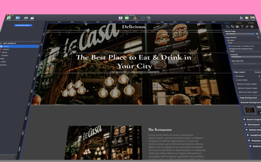
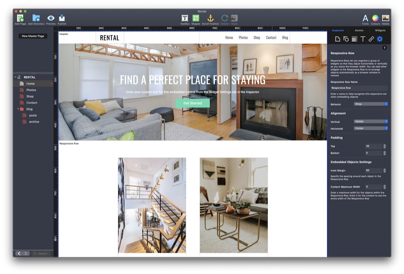
Also remember that EverWeb comes with a free stock image library of over 500,000 images to help you choose the perfect images for your site. Just click on the Media button in the Toolbar and select the ‘Free Stock Photos’ option. Enter in your search criteria, then drag and drop the image you want to use into the Editor Window.
SEO Matters…
As you are building your website, you may also be aware that you need to get your site’s pages as high up in search engine results pages as possible. So remember as you design your pages to add in Search Engine Optimization (SEO) key words and phrases to pages that you want to be relevant for SEO. You do not need to include SEO for pages such as Contact Us and About Us type pages. Check out our SEO for EverWeb Video Course for a full tour of SEO and how to easily and quickly apply it to your website.
If you are selling good and services online or your need to maximise your website’s potential, you may also want to consider EverWeb’s SEO PowerUp Addon. The Addon lets you refine your SEO allowing you to assign priority and frequency to your website’s pages, creates and SML Sitemap that can be crawled by web crawlers, optimises your site for search engines, submits your pages to Google, Bing, Yahoo and Alexa, and makes your pages load faster for your visitors using GZip Compression.
And keep an eye on this blog and the EverWeb User Forum for exciting news coming for SEO in the upcoming EverWeb 4.0 release!
Securing Your Website
Whilst SEO will help your page rankings improve, your site’s security is ever more an important issue to keep in mind, both for your site itself and also for your visitors. Most sites today are secure so you see a padlock next to your site’s name in the browser search bar. This indicates to your visitors that data transmitted to and from your site’s server is end to end encoded. The other plus point here is that search engines rank secure websites above non-secure websites. All of these features are available with EverWeb’s Site Shield Addon including Enhanced Security Settings for advanced website security. EverWeb Site Shield Addon is available for purchase through your EverWeb Client Area.
At the moment Site Shield Addon is available only to EverWeb+Hosting customers, but stay tuned as that is about to change in the new EverWeb 4.0 release which should make this addon available to everyone.
Contact Forms
Communication and interaction with your customers is vital to keep a thriving business, especially online. EverWeb’s Contact Form Advanced widget enables you to create powerful, flexible forms to help you engage more effectively with your customer base. You can take your contact management one step further though with EverWeb’s Contact Forms Enhanced Addon. This addon is great when you want to store email addresses for later use and collect data from contact form submissions for analysis. You can design your contact forms for specific campaigns you want run through your website.
Contact Forms Enhanced also lets your visitors upload files to you through the contact formant mass emailing features are also available. For details about purchasing this addon, check out EverWeb’s Online Store. There will also be more features in EverWeb 4.0 to further revolutionize contact form design!
Membership Sites…
Our final consideration is to add a Membership Site to your website so that your visitors can access free and paid for content by signing up to your Membership Site. Easy to use. Easy to set up. Easy to administer and fully featured. It’s coming soon in EverWeb 4.0!
Setting up your website and adding in the features that you need to make your business safe and secure and profitable is easy with EverWeb. Our upcoming EverWeb 4.0 release is going to add great new features and enhancements to make your website building experience even better.
If you have a question about this post, please let us know in the Comments Section below.


 Twitter
 Facebook
 Youtube
 Blog RSS